
By Catherine Austin Fitts
My “go to” website for technical analysis of precious metals, the US dollar & the US stock market is Rambus Chartology, where Rambus (that’s his handle – he’s the founding technical analyst) leads a discussion with extensive charts of what the markets are saying.
In January 2016, Rambus launched his quarterly Solari Report with a Blockbuster Chartology. You can find links to the entire series of quarterly and annual Blockbuster Chartologies at the end of this latest piece.
One of the reasons that Rambus is so good at his craft is that he focuses on “staying on the right side of the major trend.” The challenge of doing so at this time is that it is tempting to look for bottoms or to assume that the trend upwards in the US dollar or stock market may be over. However, Rambus consistently brings us back to the discipline of the Chartology. What does price tell us? As he describes so aptly, we are dealing with psychological warfare.
Sitting back once each quarter to get this perspective offers invaluable insight. So, here we go for the Annual 2022 Wrap Up Blockbuster Chartology!
Blockbuster Chartology Quarterly Report
By Rambus
~ Annual 2022 Wrap Up ~
PM Complex
Long Term Charts
Commodities
PM Complex
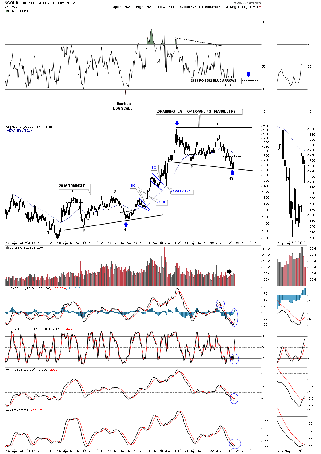
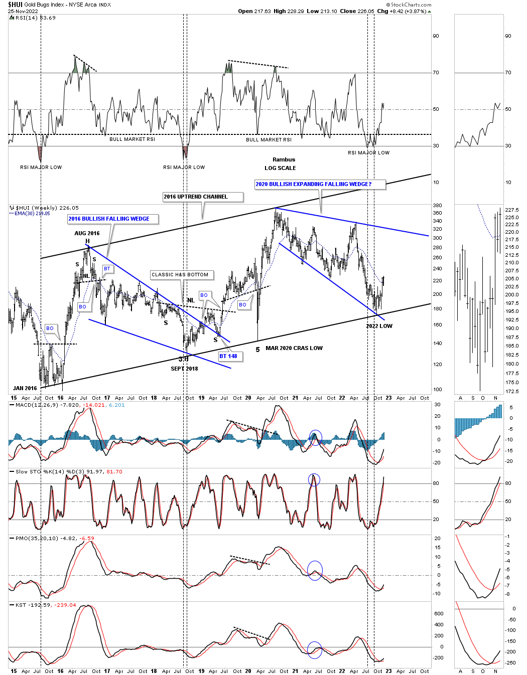
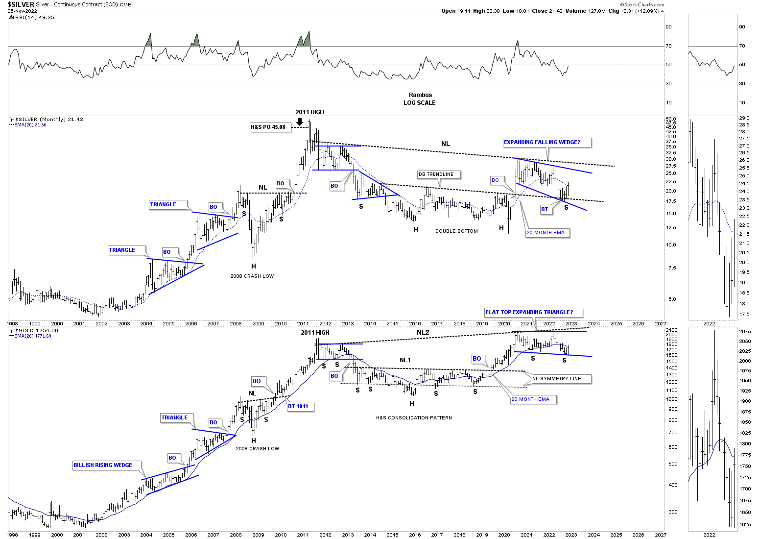
Tonight I would like to update some of the PM complex charts from a post I did one month ago on November 25th. There hasn’t been any really big changes, but most of the changes have been on the bullish side of the equation. Most importantly support has been holding on the longer term timeframes.
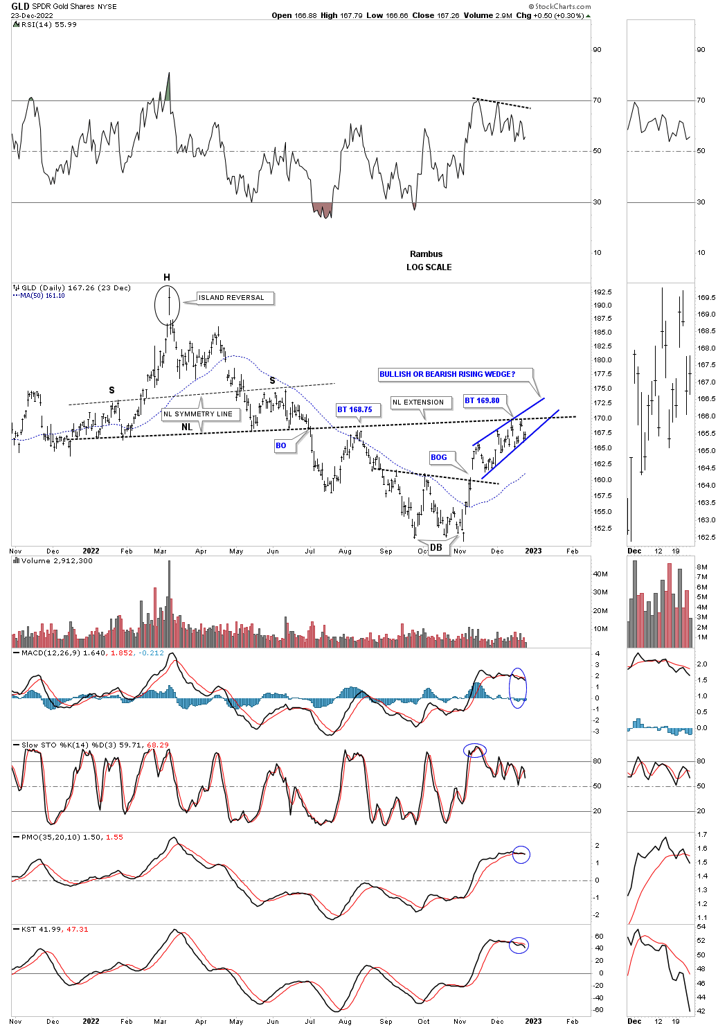
First lets look at a few short term charts for GLD we’ve been following on a daily basis showing the rising wedge which still hasn’t shown us its hand yet. Below is the short term daily line chart which shows the double bottom with the blue rising wedge which is getting tighter and tighter.
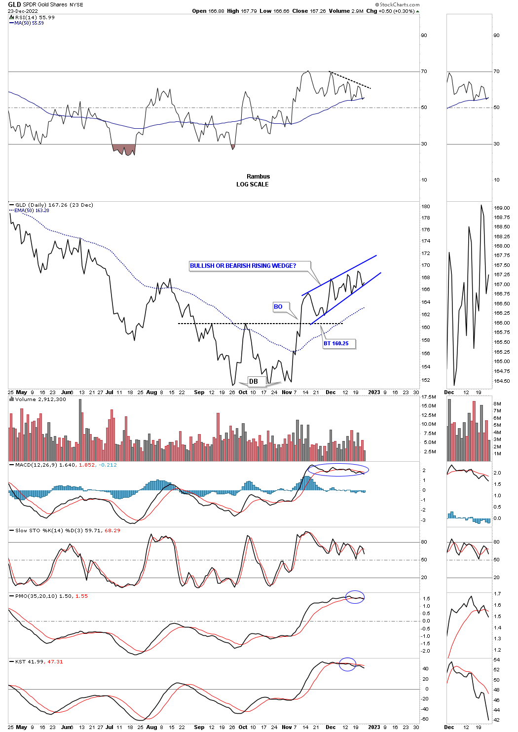
This second chart for GLD shows the double H&S top with the double bottom reversal pattern and the blue rising wedge which has reached the backtest point on the neckline extension line. A break back above the neckline extension line would be positive for GLD and a break below the bottom rail of the blue rising wedge would be negative with first support coming in around the 30 week ema or the double bottom trendline. So we wait.
This is what I wrote on November 25th 2022.
November 25th:
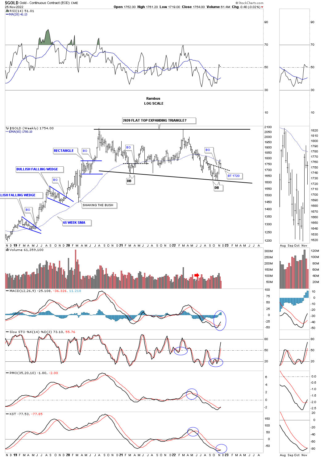
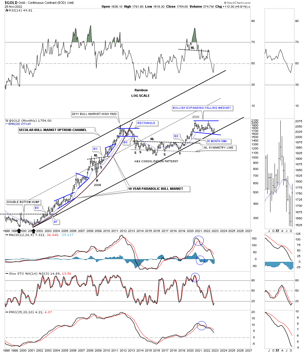
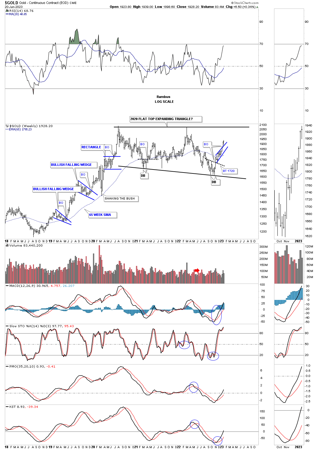
Since the 2020 high Gold, HUI and Silver have all formed a similar trading range that I will try to put in perspective from the short, intermediate and long term charts. Even though the patterns are not exactly the same they all have similar characteristics that make the current low, THE, low for the 2020 correction. Keep in mind when you look at the charts to follow that the 4th reversal point won’t be completed until the top rail of the 2020 trading range is hit.
Lets start with Gold which shows its 2020 trading range as a flat top expanding triangle that formed after a nearly two year rally. Currently you can see the possible very important double bottom that is forming at the recent low. Last week there was a backtest to the double bottom trendline which held initial support which marks an important low risk entry point as long as the double bottom trendline holds.
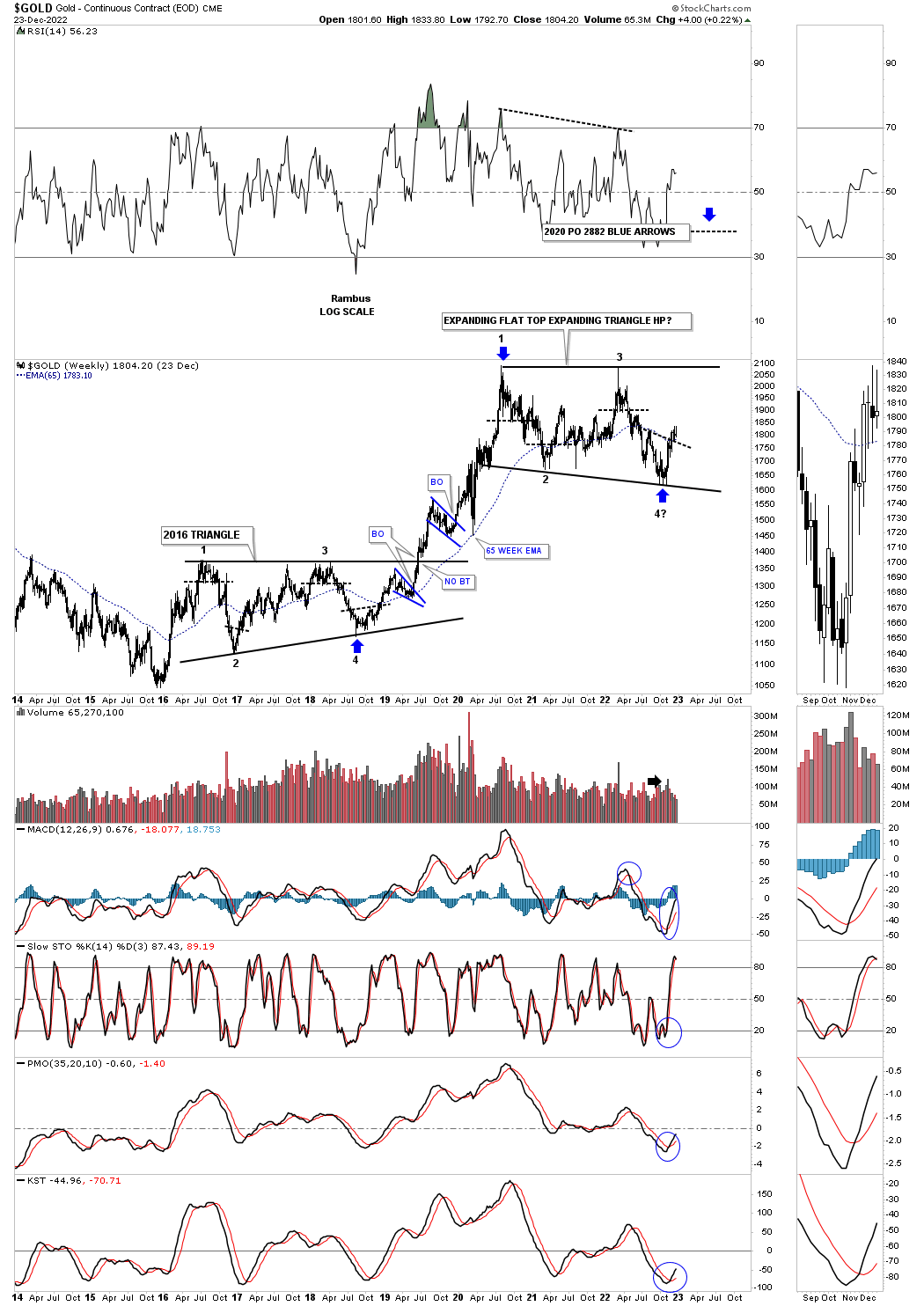
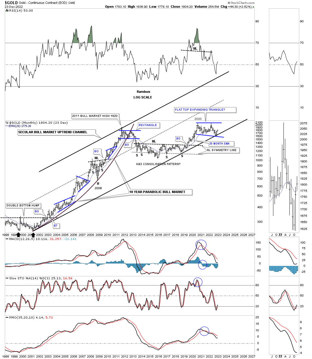
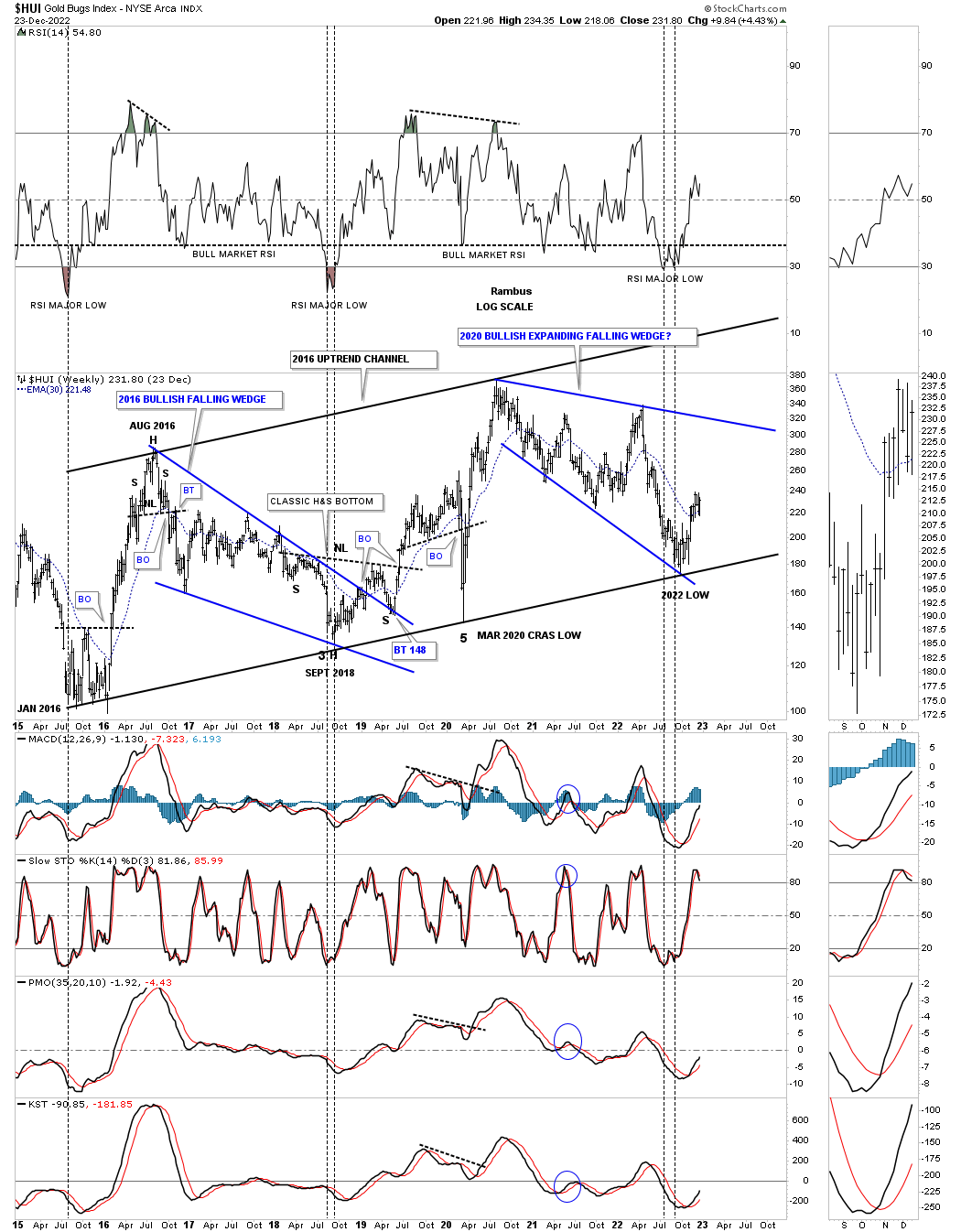
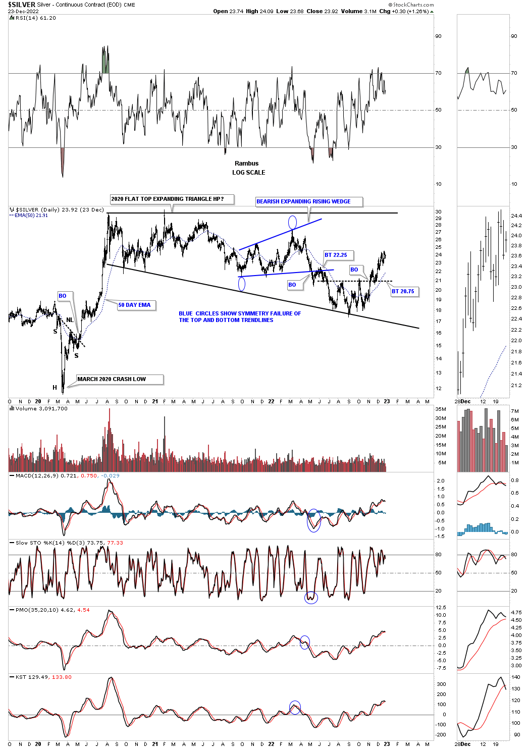
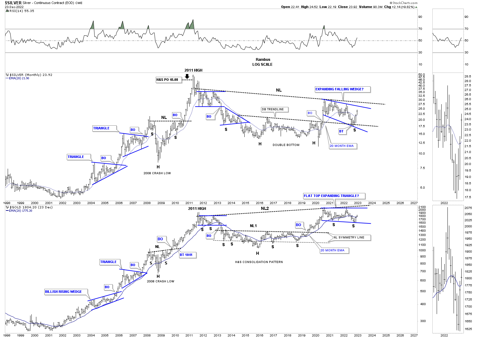
December 26th:
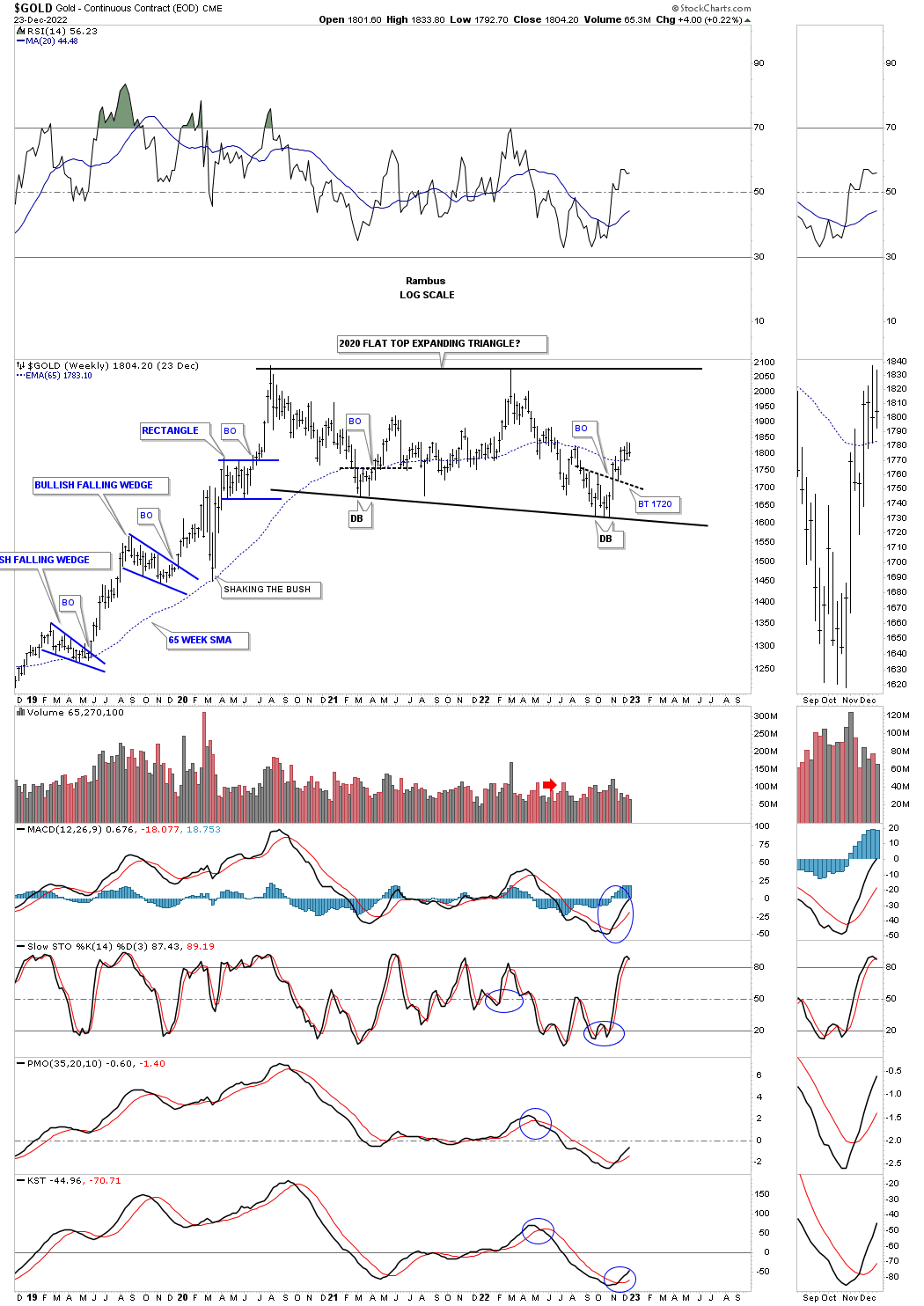
The backtest bar held support with GLD closing above the 65 week ema.
November 25th:
Looking out a little further in time you can see how the 2020 flat top expanding triangle fits into the slightly bigger picture as a possible halfway pattern. Since the 2016 triangle formed above the 2016 low it only needed four reversal points to be a valid consolation pattern that worked out beautifully. That strong impulse move that began at the 4th reversal point formed several smaller consolation patterns before the price action finally topped out in August of 2020 where the current flat top expanding triangle began to form. If this is the 4th reversal point the blue flat top expanding triangle will have a price objective up to the 2800 area as shown by the blue arrows.
December 26th: Backtest still holding.
November 25th:
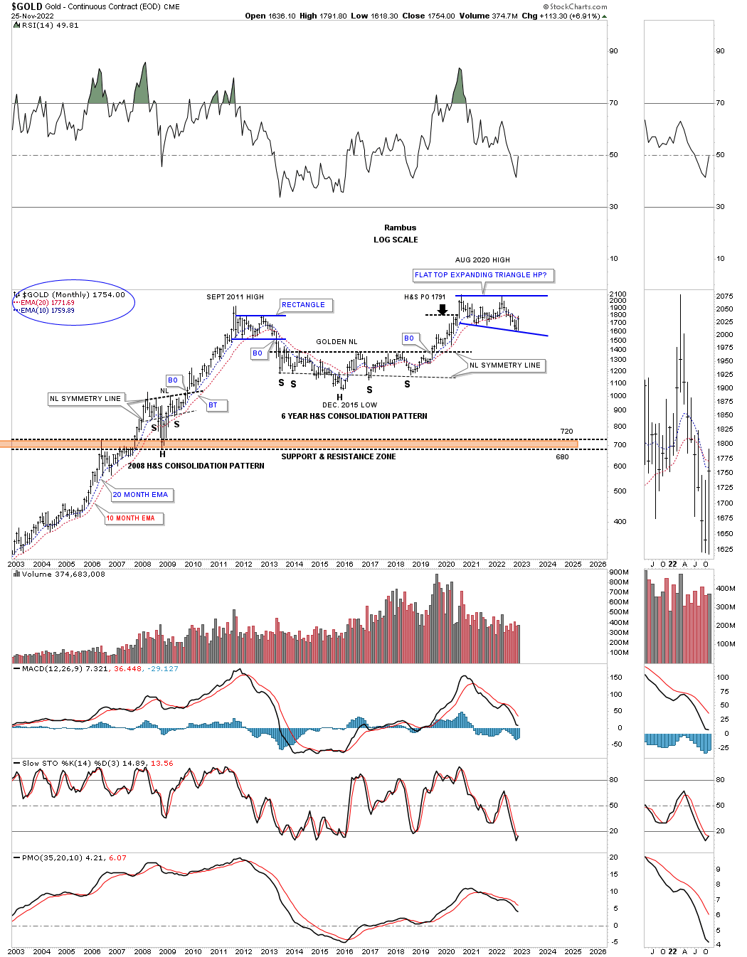
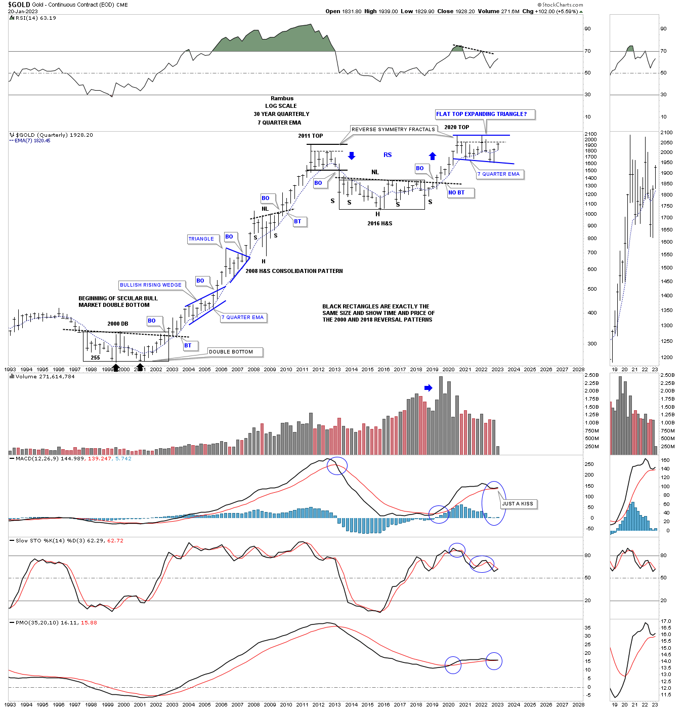
Lets go back even further in time to see how the 2020 flat top expanding triangle looks relative to the other trading ranges before it. In 2008 Gold formed a fairly large H&S consolidation pattern that led to the blow off top in 2011. Gold then formed the blue rectangle that ended up having six reversal points before the price action broke to the downside. Again, the blue rectangle began to form below the 2011 high which is why it needed an even number of reversal points to be a consolidation pattern.
The bear market that followed the 2011 high finally came to an end with the formation of the nearly 6 year H&S consolation pattern. I’m calling it a consolation pattern because it is still forming in the 2000 bull market. The minimum price objective was hit, black arrow, with a little more follow through to the upside before that particular impulse move came to an end where the 2020 flat top expanding triangle began to form.
Gold still has a lot of work to do like closing a month above the 10 and 20 month ema’s for starters. Using the bottom rail of the 2020 flat top expanding triangle as a line in the sand you can see the risk to reward ratio massively favors the bulls especially if we are witnessing the last reversal point.
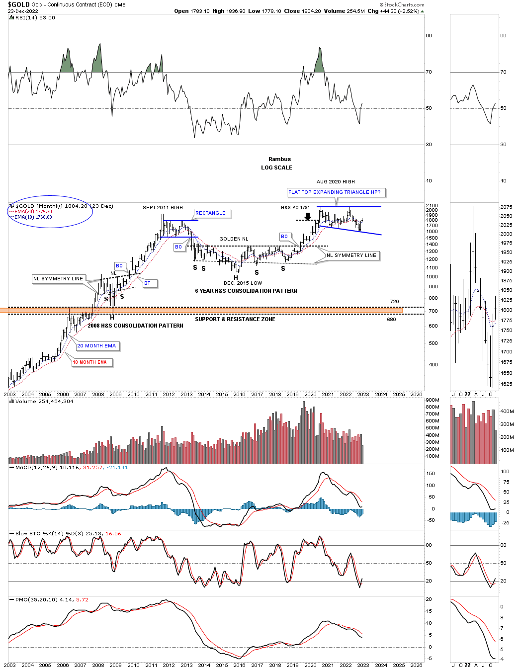
December 26th:
With 4 more days of trading for 2022 Gold is now trading back above its 10 and 20 month ema for a long term buy signal if the price action can hold above those very important moving averages.
November 25th:
Going all the way back to the beginning of the secular bull market note how the 2020 flat top expanding triangle fits into the secular bull market parallel uptrend channel. Looking at the blue consolation patterns that formed from the 2000 low to the 2011 high makes the current flat top expanding triangle look pretty normal. Make a mental note of where the price action is currently finding support which is the bottom rail of the 2000 secular bull market uptrend channel.
December 26th: Support still holding with the price action trading above the 20 month ema with four days to go.
November 25:
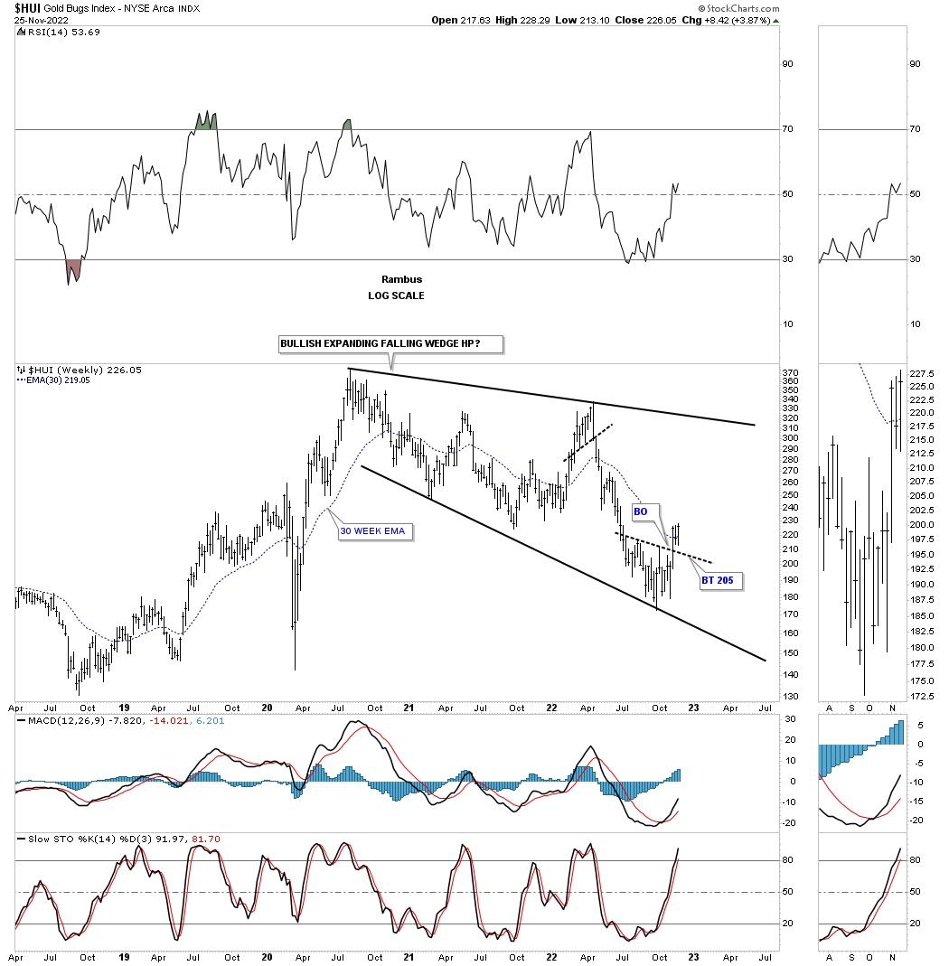
Now lets look at the HUI and the 2020 expanding falling wedge we’ve been tracking for a very long time. Again, you can see a possible smaller bottoming pattern forming at the last reversal point. Last week the HUI closed above above its 30 week ema which is a positive.
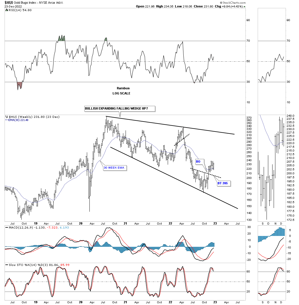
December 26th:
The HUI is about 5 points higher then on November 26th and holding the 30 week ema.
November 25th:
This next weekly chart for the HUI shows the previous blue 2016 bullish falling wedge which led to the rally that ended at the 2020 high. Note how many times the bottom rail of the 2016 uptrend channel has been touched. Also, you can see when the RSI gets as low as it did recently, the HUI had two previous rallies of equal time and price. The further the price action gets above the recent low the higher the risk factor becomes if the bottom rail of the 2016 uptrend channel is tested once again.
December 26th: 30 week ema still holding support.
November 25th:
When we looked at the long term chart for Gold, which showed its secular bull market that began at the 2000 low, the bottom trendline was being hit where the bottom rail of its flat top expanding triangle was intersecting it. The same thing is now happening with the HUI which is finding support on the bottom rail of its 2000 parallel secular bull market uptrend channel. Note how many times the bottom trendline of the 2000 secular bull market has been tested.
December 26th: A slightly higher monthly high this month.
November 25th:
Now lets look at the 2020 flat top expanding triangle for Silver which is attempting to put in a bottom at the last reversal point. At this stage in the development of the 2020 consolidation pattern the 30 week ema needs to hold support in order to keep the low risk entry points alive. The bottom trendline has already been tested on multiple occasions which makes it very important.
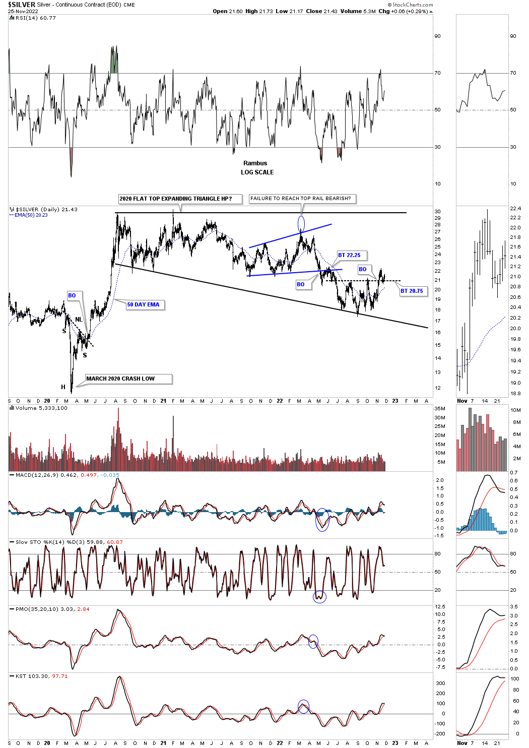
December 26th: The backtest held.
November 25th:
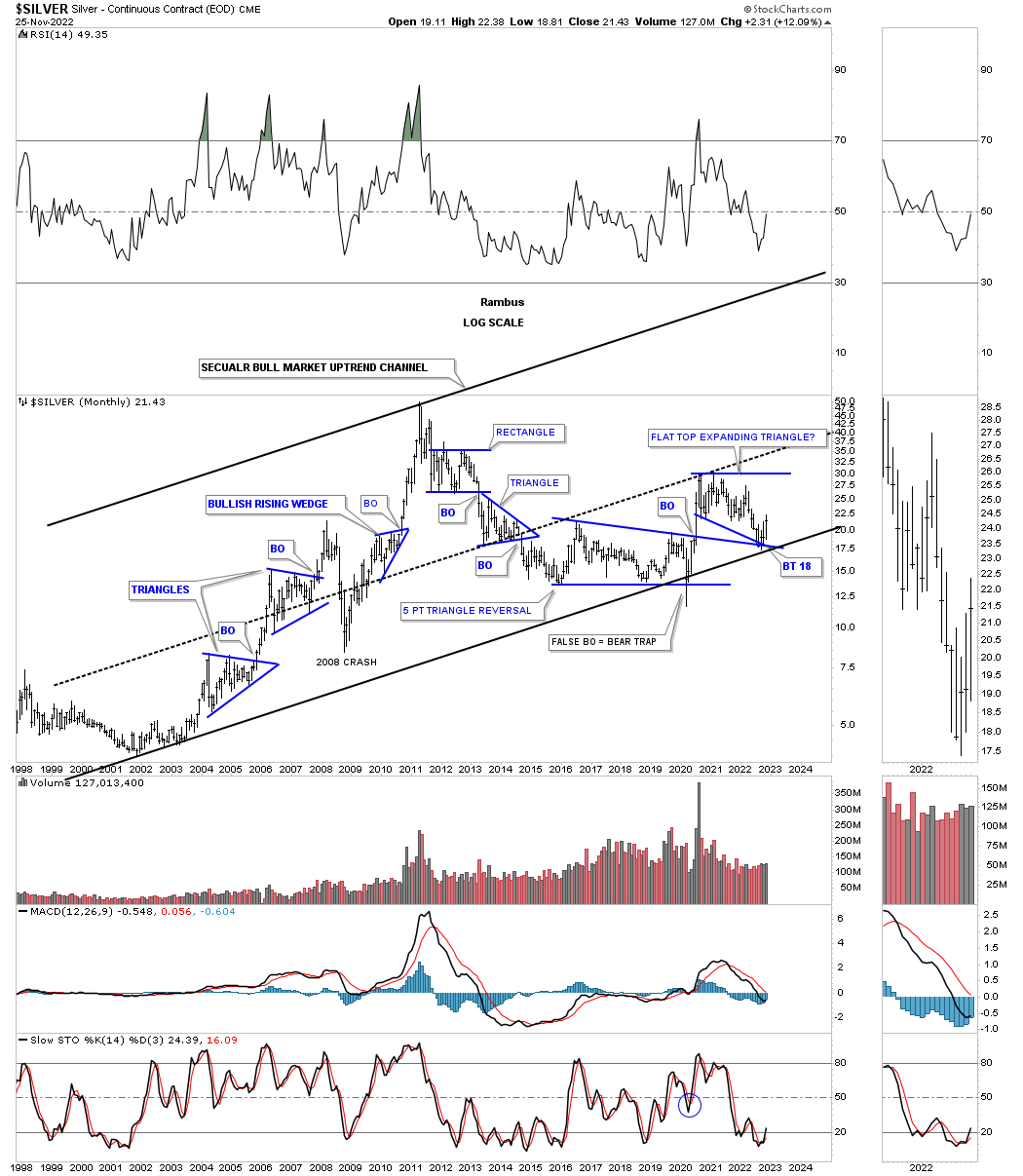
We looked at the secular bull market for Gold and the HUI, now let’s look at the secular bull market for Silver. Again, you can see how important the bottom trendline is by the number of touches it has. The bottom rail of the 2020 flat top expanding triangle is also intersecting the bottom rail of the 2001 secular bull market uptrend channel and is also finding support.
December 26th: Now two long monthly bars off the bottom.

November 25th:
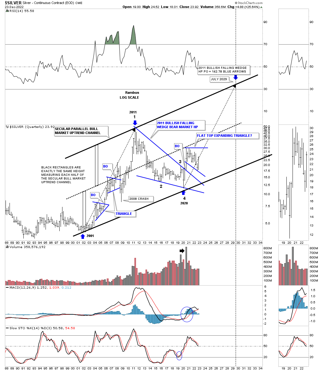
This quarterly chart for Silver is slightly different from the monthly chart above. On this chart I used the 2001 and 2020 lows to form the bottom trendline. If the 2011 bullish falling wedge is going to end up being a halfway pattern to the upside, the black arrows show the possible time and price objective where we could see the high for the second leg up.

December 26th: Silver is still falling the blue arrow higher.
November 25th:
This last chart for tonight is a combo chart which has Silver on top with Gold on the bottom. This combo chart also shows the secular bull market using the possible H&S consolidation pattern as a halfway pattern.
December 26th:
December 26th:
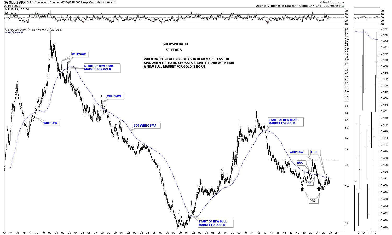
For the flip side of the coin. This weekly chart shows the 2011 top with the 2020 trading range and the possible double top if the price action can’t breakthrough the double top trendline.
December 26th:
The ratio is testing the 200 week moving average once again.
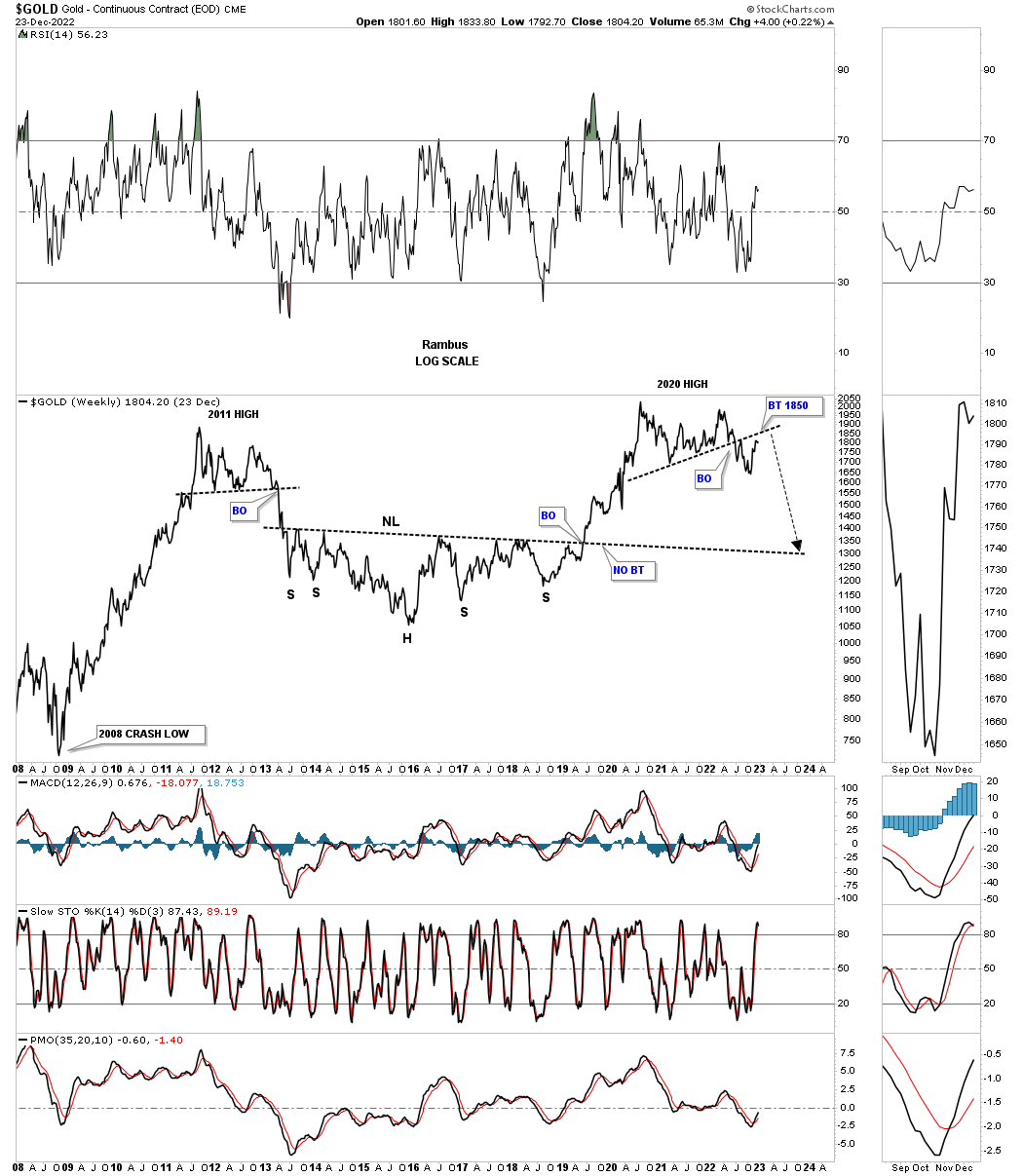
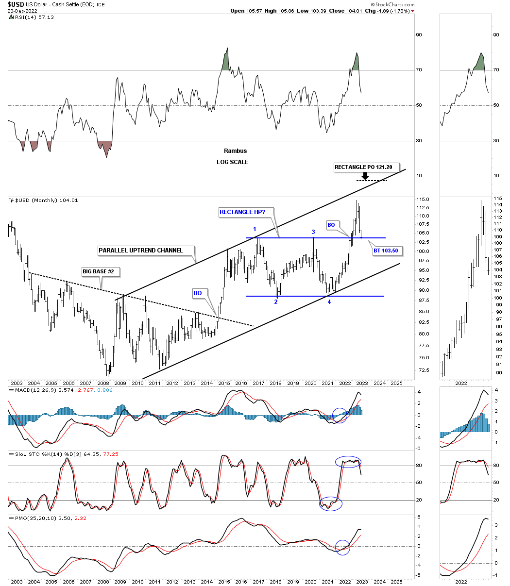
The US dollar is going to be key if the PM complex is going to have a sustained rally. It is these three US dollar charts below that give my pause for concern for the bullish side of the PM complex. If the top rail of the multi year rectangles fail to hold support that would be a bullish scenario. The backtest in in full swing. Is the top rail going to hold support? All the best…Rambus
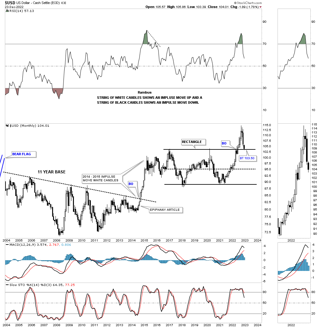
US dollar monthly long term.
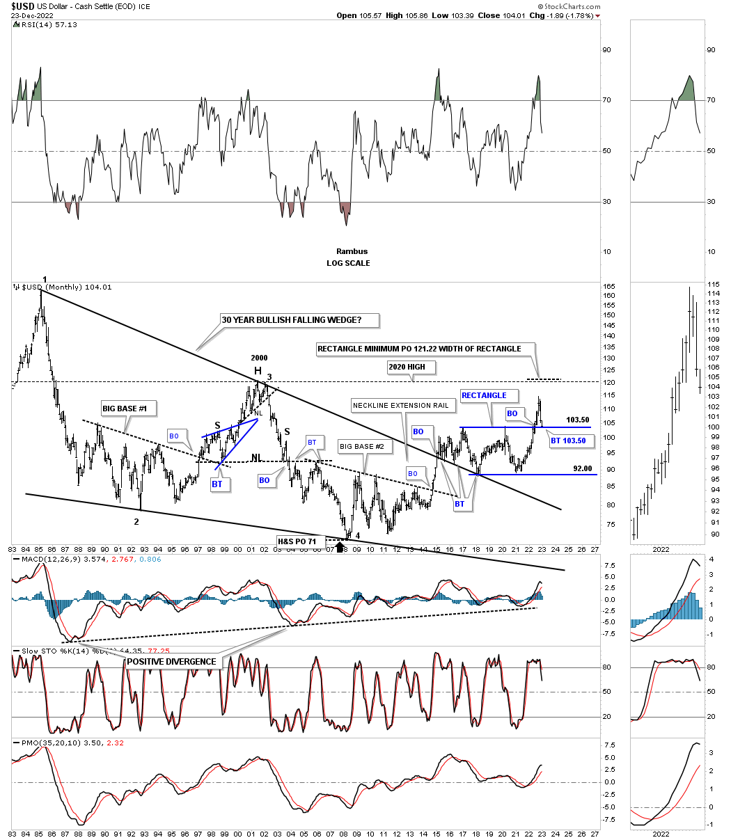
US dollar uptrend channel.
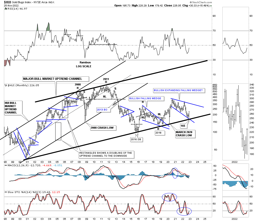
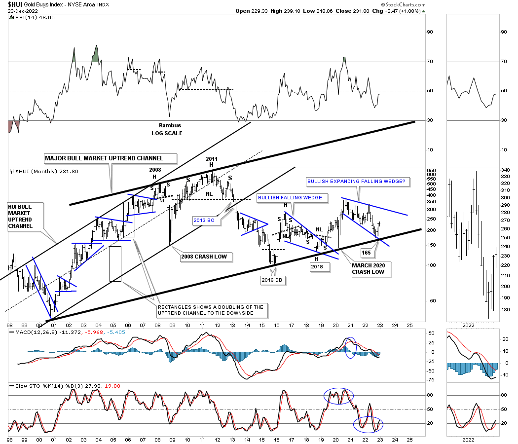
PM Complex Update
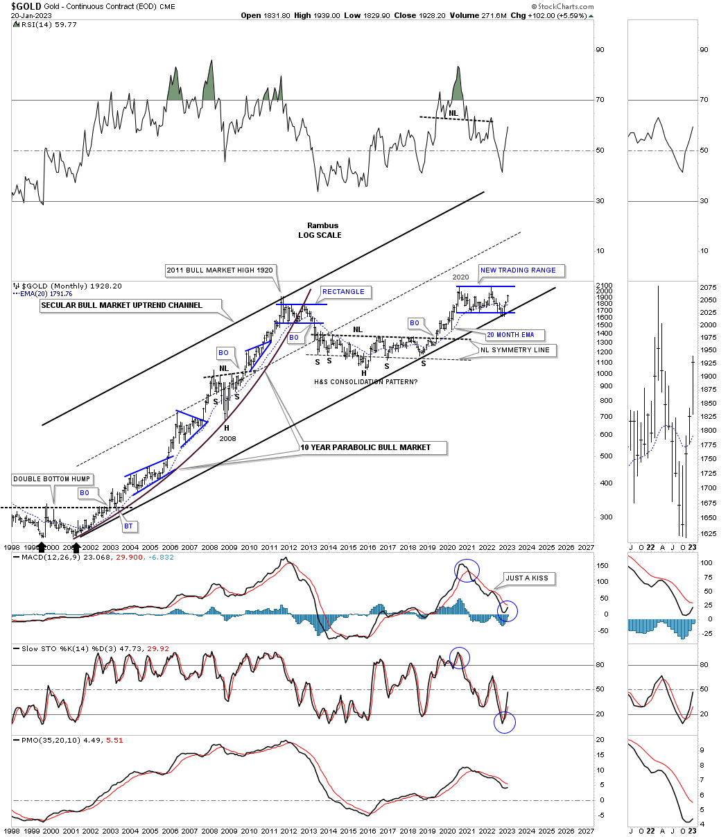
Tonight I would like to update some long term charts for the PM complex that we’ve been following for a very long time in many cases, and bring the past into the present. If you’ve been with Rambus Chartology for any length of time you know that I like to look at reverse symmetry for instance or how large the size of a trading range is that strongly suggests the size of the impulse move.
After the first phase in the secular bull market for the PM complex, which ran from 2000 to 2011, it was time to consolidate those gains. It took a cyclical bear market to reset the sentiment back in favor of the bulls which occurred at the low in 2016 which ended up being the head of a large H&S consolidation pattern. Once the 2016 H&S consolidation pattern completed its work came the first leg up in the 2nd half of the secular bull market which continues to this day.
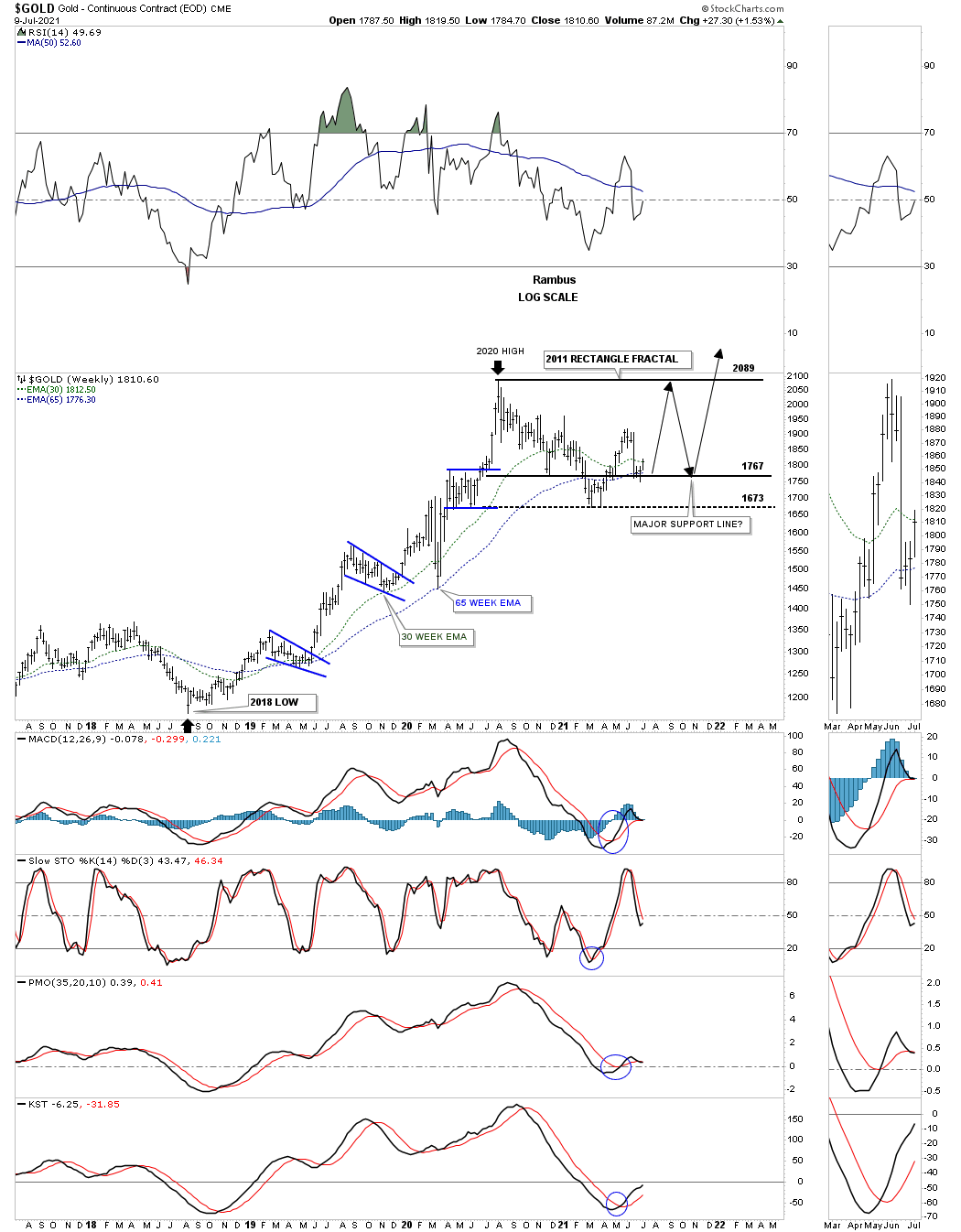
I would like to start with what I wrote back on July 9th, 2021 to show you what I was looking for at the time for Gold. What I knew was that Gold had just completed a nearly two year impulse move with one consolidation pattern forming on top of the previous one and had just broken out above the 2011 high at 1920, but was running out of gas.
This is when I began to look for some type of consolidation pattern to start forming with the only real possibility was something similar to the 2011 rectangle in time and price, reverse symmetry.
This is what I wrote on July 9th 2021:
There are times in the markets when there is no clear cut direction which has to be respected regardless if one is bullish or bearish. Much of the time the markets or a stock is building either a reversal pattern or consolidation pattern which usually takes up most of the time sequence. The rest of the time the markets are in an impulse move moving out of a reversal or consolidation pattern.
The toughest part of trading the markets is to know if the price action is either in a trading range, reversal or consolidation pattern, and then is ready to begin the impulse move. Trading ranges are notorious for breaking the spirit of most investors that don’t understand what is going on as we are finding out with the correction in the PM complex that began in August of 2020 which is now 11 months and counting.
You can blame me, the fed, manipulation, the big banks or a host of other reasons why the market isn’t performing according to what ones expectations are. That’s the beauty of the markets. There are so many rules that are cut into stone that the markets must adhere to that it becomes impossible for many investors to think outside of the box. They read every analyst they can find to support their view and often times they are left holding the bag when things don’t turn out like it is supposed to.
I mentioned in Friday’s Sell/stop Update that I had almost as many bearish charts for the PM complex as I do bullish. It isn’t by design or accident that I have some bullish and bearish charts in the same category, it is what the PM complex has given me to work with. With that being said lets see what Gold has given us to work with from a Chartology perspective.
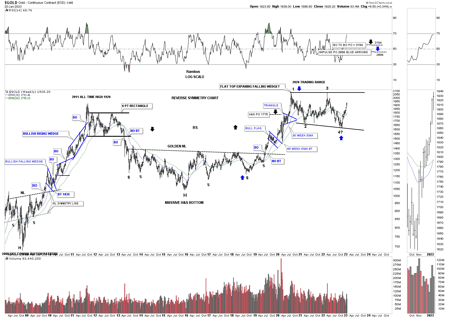
Let’s start with one of the most important charts for Gold which is the reverse symmetry fractal chart we’ve been following pretty closely. I pointed out several months ago, when the possible reverse symmetry fractal became a possibility, that I suggested that the 1780 area would need to hold support in order for the fractal to have a chance to play out. This month is still very young, but if you look at the last bar on this long term monthly chart the solid blue line at 1780 is still holding support so nothing is broken yet.
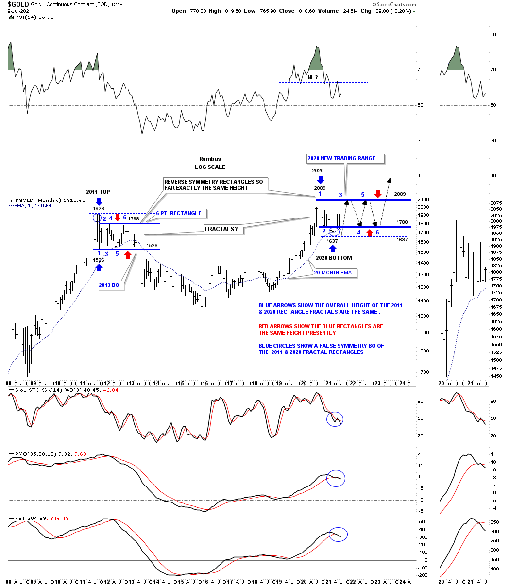
Today January 22, 2023:
As you can see Gold is still in the 2020 trading range which has gotten even bigger. The 2020 trading range hasn’t played out exactly like the 2011 trading range, but knowing that Gold is in a secular bull market and the reverse symmetry strongly suggesting to look at the 2011 trading range for guidance gave us a chance to keep most of our trading capital intact which we have mostly deployed now.
July 9th 2021:
Next is a close up view of the current 2020 fractal as shown on the chart above. [ July 9th, 2021 chart ]
Today January 22, 2023.
Below shows the current 2020 trading range and how it has progressed since July 9th 2021. Note the small double bottom as a reference point on the chart above in 2021.
From that same article I wrote back on July 9th, 2021 I pointed out the 2000 secular bull market and how the blue 2020 trading ranged looked back then.
July 9th 2021:
Gold was in a full blown bull market from 2000 to 2011 which actually went parabolic. Next came the inevitable correction that ended up becoming a cyclical bear market. If you compare our current trading range to those of the 2000 to 2011 bull market years it is still relatively small. From the right shoulder low you can see a very strong impulse move that needed a rest to consolidate those gains which we are getting. So again from this perspective nothing is broken just investors patience.
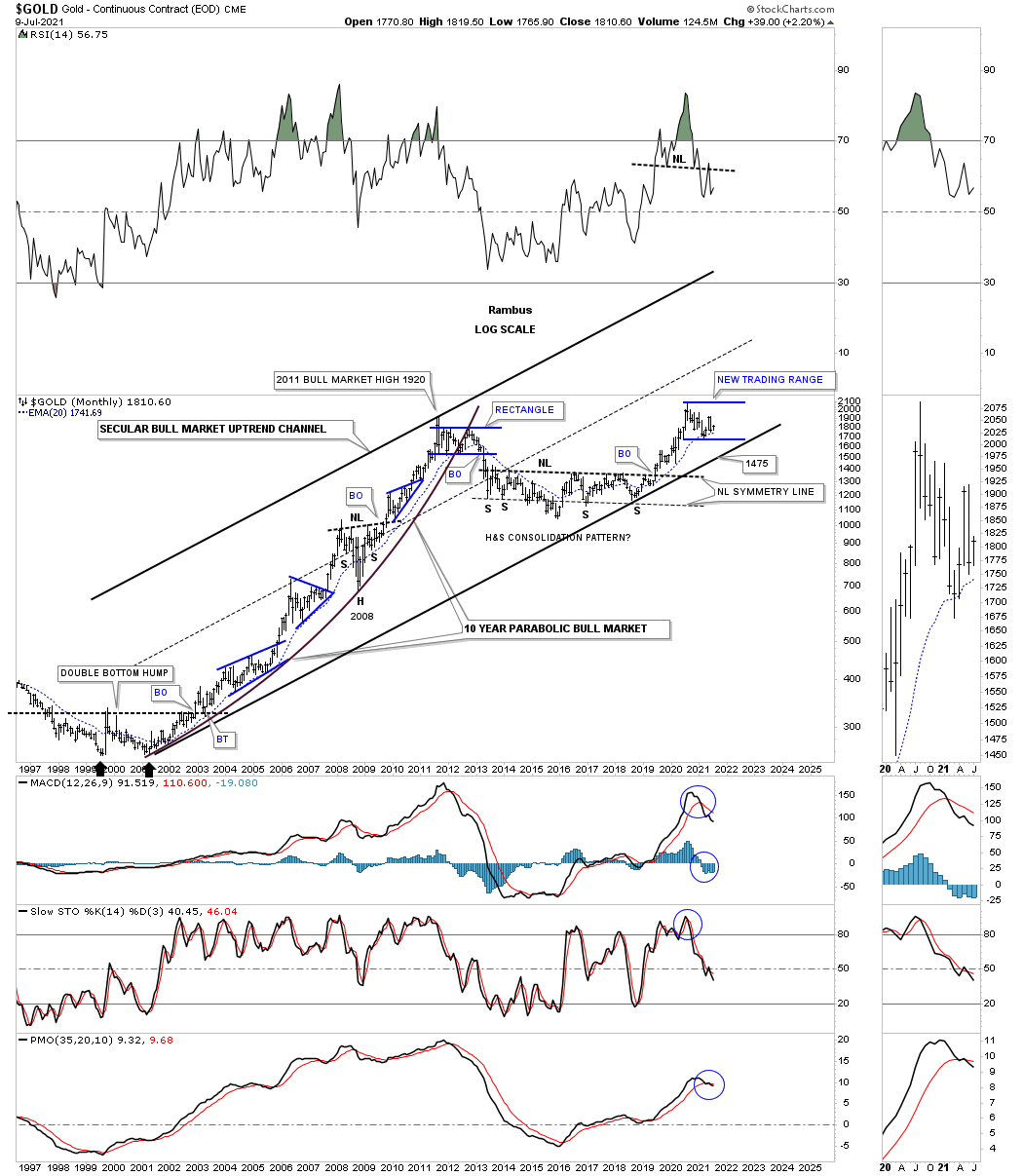
Today January 22, 2023:
Note how Gold kept trading sideways until the bottom rail of the 2000 secular bull market uptrend channel was touched. Gold is now in month three of where the bottom rail of the blue 2020 trading range and the bottom rail of the 2000 secular bull market uptrend line intersect. Gold is also in its 2nd month of trading back above the 20 month ema which is on a long term buy signal.
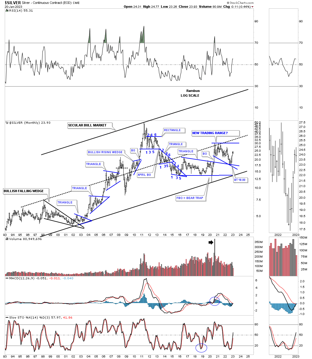
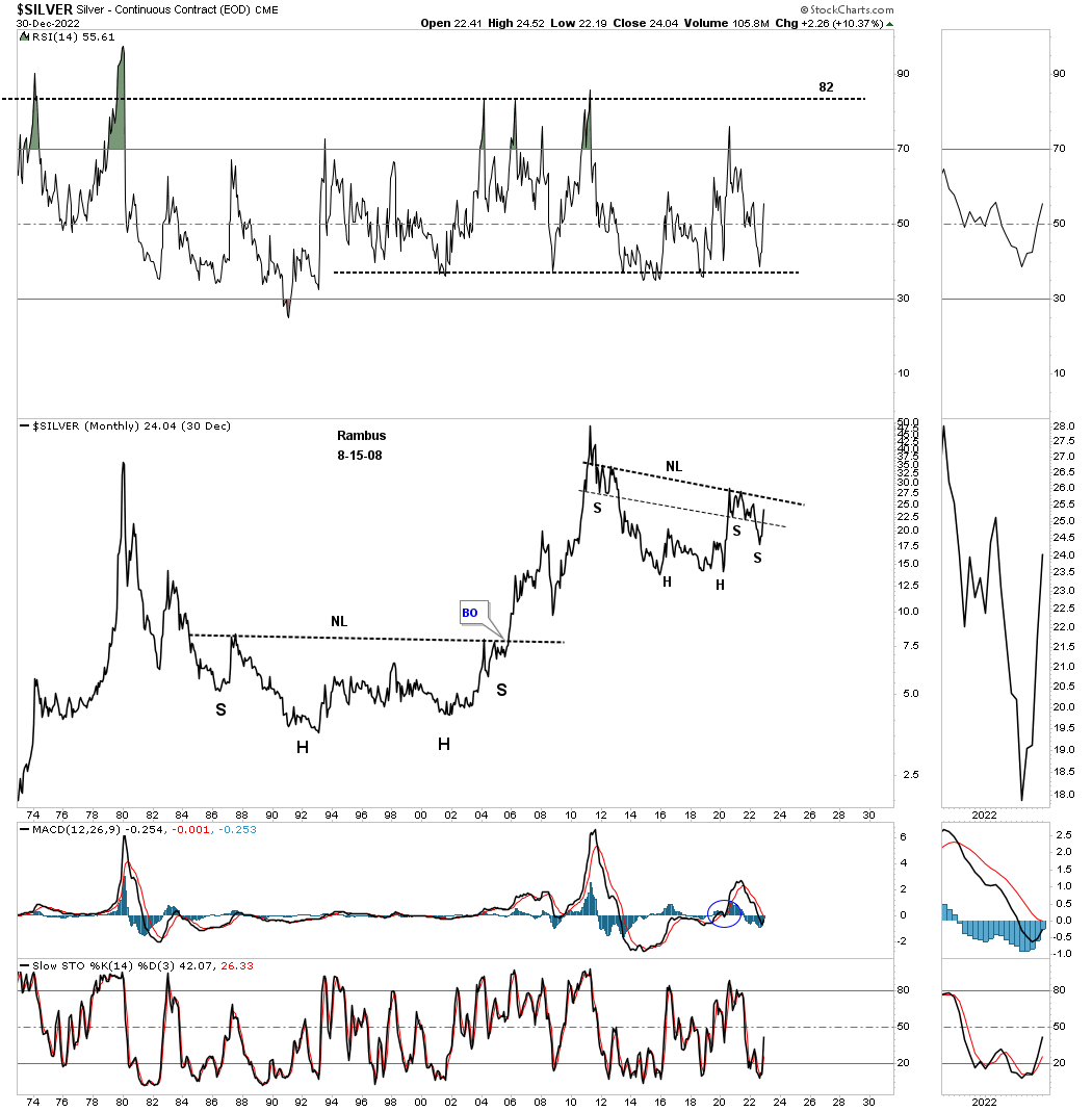
Below is a long term chart for Silver which shows its secular bull market and all the chart patterns it has created so far. Silver’s cyclical bear market didn’t end until the 2020 crash low unlike the rest of the PM complex that ended in 2016.
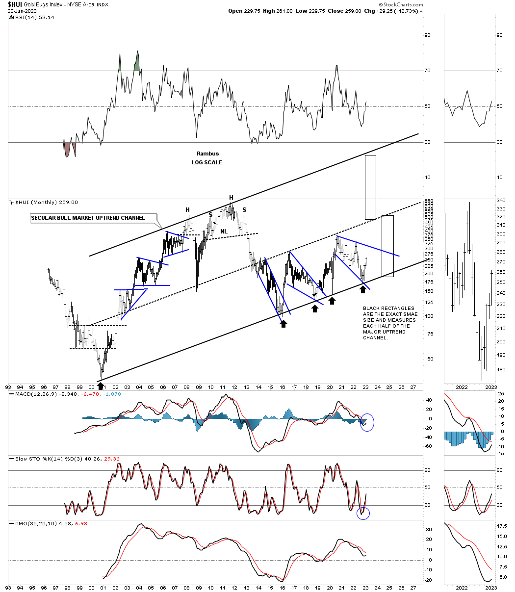
If Gold and Silver are in a secular bull market so should the HUI. Below is the history chart which shows all of the HUI’s most important chart patterns. As you can see the bottom rail of the secular bull market has been touched five times and has gotten a good bounce each time.
What can happen in a major uptrend channel like this is that the price action can trade in the upper part of the channel for long periods of time and then moves back into the lower part of the channel as shown by the 2016 bear market low. Since that 2016 bear market low the HUI has been trading inside of the lower half of the secular bull market uptrend channel. When the time is right I expect to see the HUI cross above the center dashed midline like in 2002 and reach the top rail of the secular bull market uptrend channel. The black rectangles show a perfect parallel uptrend channel.
Lets switch back to a long term quarterly chart for Gold which compares the massive base that was made at the 2000 low to the 2016 H&S consolidation pattern. I used a black rectangle to measure the time and price of the 2000 bottom and transposed it to the 2016 H&S consolidation pattern to show how close in time and price these two massive trading ranges were. If the 2000 trading range was big enough to launch an eleven year bull market then the 2016 H&S consolidation pattern, which is the exact same height but two quarters longer in time, should have enough energy to launch a similar bull market.
The first trading range that formed out of the 2000 low was the blue bullish rising wedge. I believe the 2020 flat top expanding triangle is going to be the first consolidation pattern to form since Gold broke out from its 2016 H&S consolidation pattern.
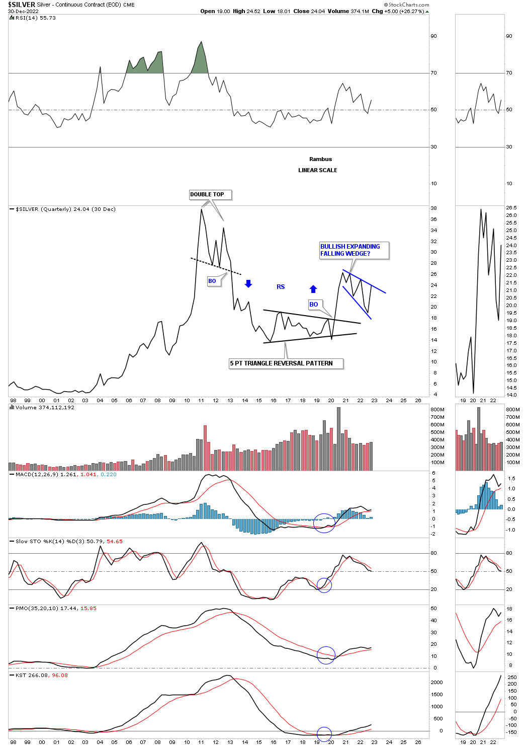
I would like to finish up by looking at several charts for Silver stating with its 2020 trading range. Silver finished up its 2020 flat top expanding triangle by forming the inverse H&S bottom at the last reversal point. If I’m correct and the long term bottom is in the PM complex then Silver will have no problem breaking out of its current blue rising flag formation.
Next is an old quarterly chart for Silver that showed some beautiful long term price action as shown by the massive double 25 year H&S bottoms. I thought after the 2011 high was reached that Silver could be forming a massive cup and handle formation, but it wasn’t meant to be. Instead the 2011 downtrend channel, which I thought could be the handle didn’t work out as I expected. There still could be a semblance of a handle, but I’m going to use the secular bull market uptrend channel we looked at earlier as my guide going forward.

This last chart for tonight is the quarterly line chart for Silver in linear scale. As you can see a quarterly line chart doesn’t show much detail but when it does it is an important pattern. This quarter is still in its first month and you can see the price action is attempting to breakout from the possible blue expanding falling wedge. Keep in mind that little rising flag formation on the daily chart for Silver above could be the catalyst for the breakout here. We won’t know for sure until the first quarter ends, but the Chartology is there.
What I’m trying to show you tonight is that I believe we are in the next important impulse move higher and this is just the beginning of the second 2nd impulse move higher for part 2 of the secular bull market that began in 2000. It will be characterized by consolidation patterns followed by an impulse move, rinse and repeat. I can assure you it won’t be easy, but if we know what is happening we have a very good chance to be successful. All the best…Rambus
Long Term Charts
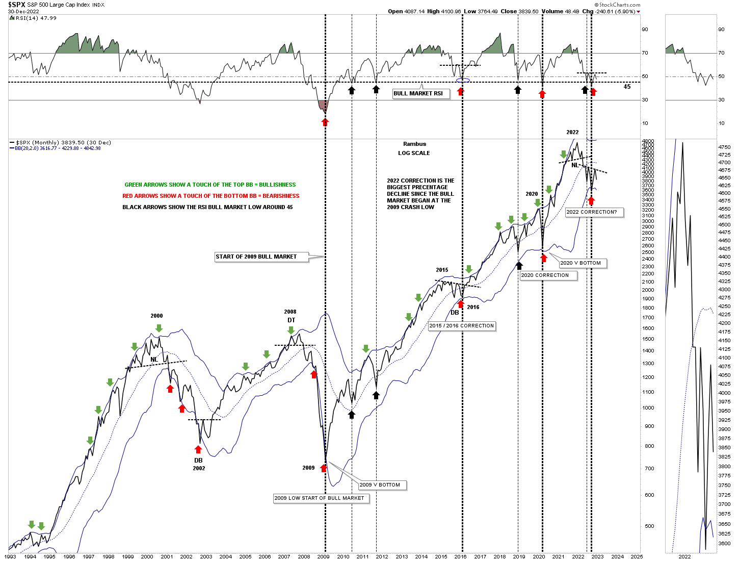
Since this weekend markets the end of the week, month, quarter and year lets look at some long term charts to see how much damage was done this year in 2022. The really big question remains, is 2022 the beginning of a new secular bear market that is going to last many years to come with a cyclical bull market once in a while? On the other side of the coin have we just experienced a cyclical bear market within the secular bull market that began at the 2009 crash low for the US stock markets?
There are many charts tonight so lets get started. This first chart is a long term monthly look at the SPX which shows its secular bull market that began at the 2009 low. If you’ve been with Rambus Chartology for any length of time you know I like to use the 21 month sma for long term buy and sell signals on the SPX. As you can see on the chart below when a buy or sell signal is given it can last for several years or longer.
Shortly after the 2020 crash low the SPX crossed up above the 21 month sma for a long term buy signal which lasted until May of this year when the SPX closed that month below it. That sell signal remains intact until the SPX can close a month above it. So far since the sell signal was given the best the SPX could do was to backtest it from below so the long term sell signal remains in place until we see where the SPX closes at the end of January.
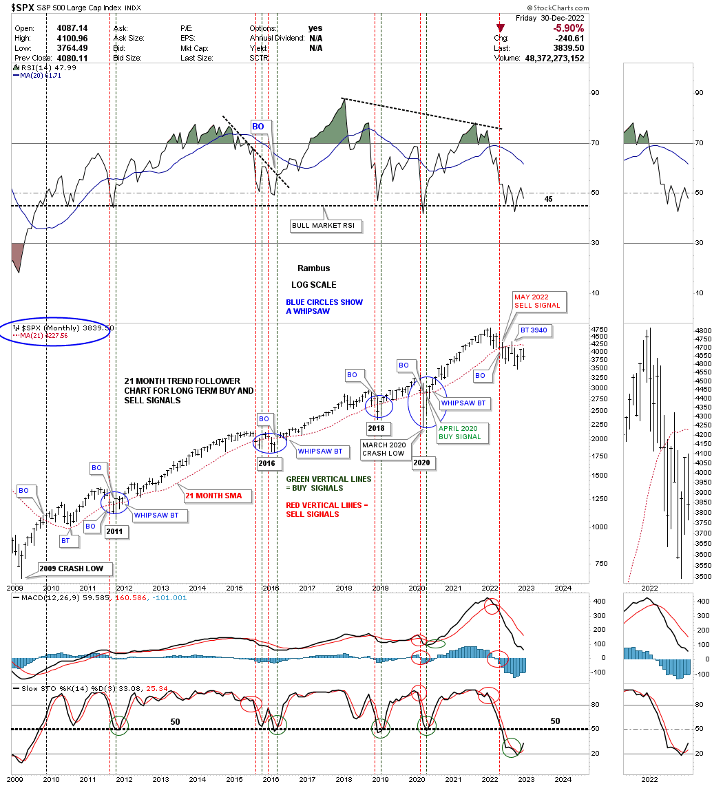
Most of the charts to follow are pretty easy to understand so I will keep it simple.You can look up to the right hand corner of the chart to see what the stock did for the month or year, blue circle.
SPX MONTHLY 1: FALLING WEDGE?

MONTHLY 2: EXPANDING FALLING WEDGE?
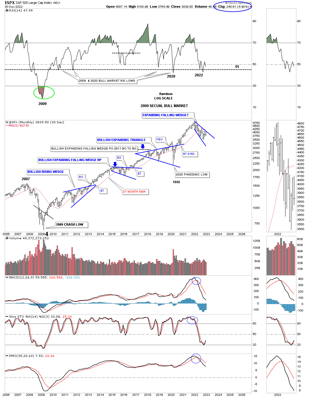
SPX MONTHLY BB: If we see something like the 2000 or 2009 crash we will see the lower BB start to decline in earnest and on the other hand if this is just a run of the mill correction in the secular bull market that began at the 2009 low then the odds are pretty high the recent low is in, red arrows. As you can see the BB’s are now pinching together and rolling over so a big move is most likely close at hand.
SPX QUARTERLY: The top rail of the expanding triangle needs to hold support during this correction.
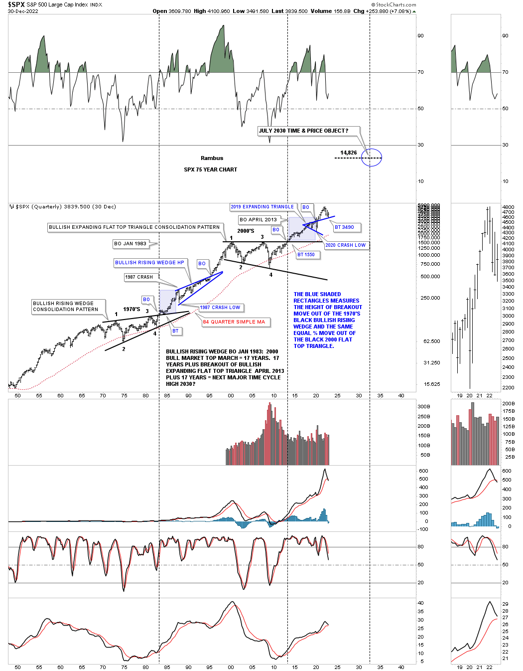
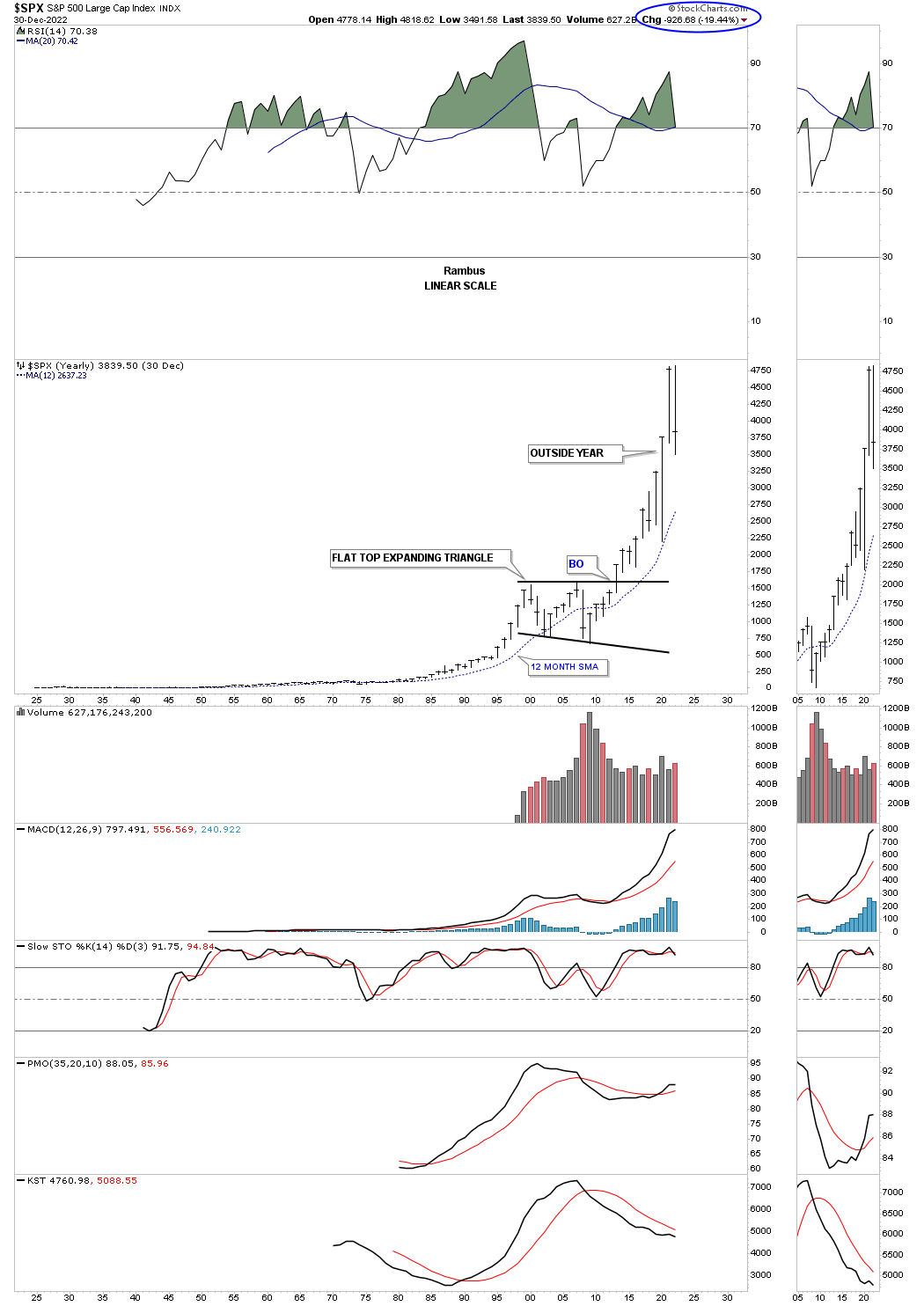
SPX YEARLY: I will be showing you the price action on a yearly chart in linear scale for the other stocks to follow as they takeout all the noise a lesser timeframe chart makes. The yearly charts are for perspective.
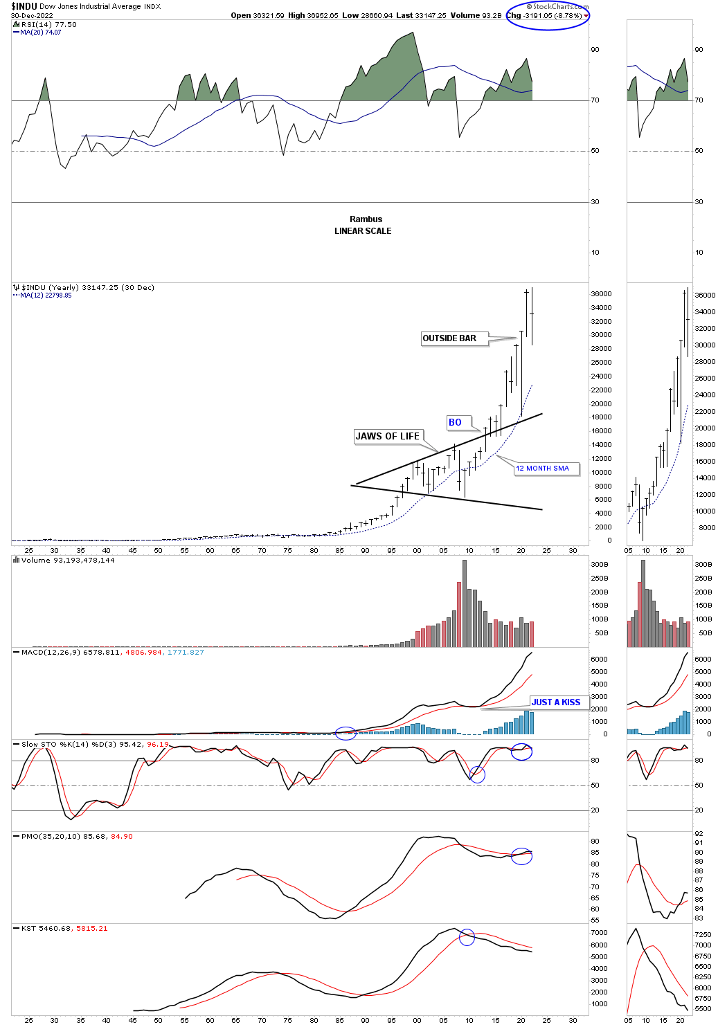
INDU MONTHLY: Backtest?
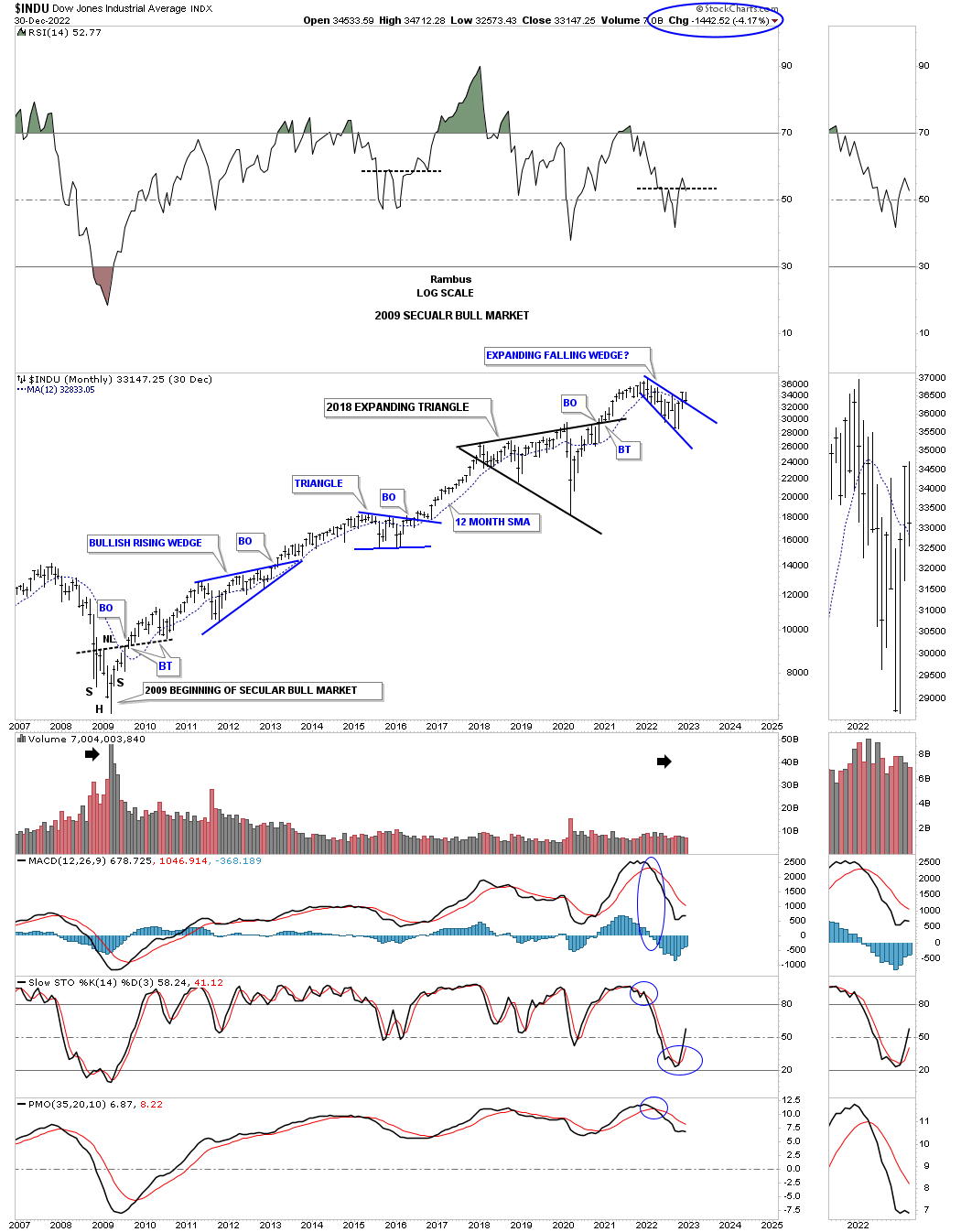
YEARLY: Holding up the best.
TRAN MONTHY: Can’t trade back above the top trendline.
QUARTERLY:
TRAN YEARLY:
QQQ MONTHLY:
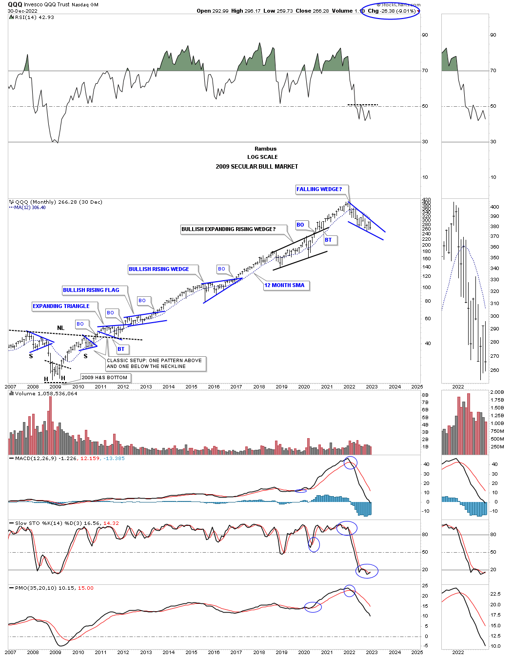
QQQ YEARLY: A new lower yearly low going all the way back to the 2009 crash low.
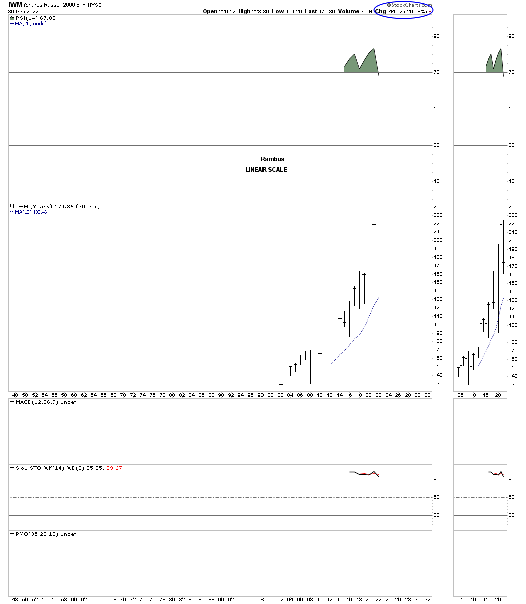
IWM MONTHLY: Still finding support on top of the 2016 flat top expanding triangle.
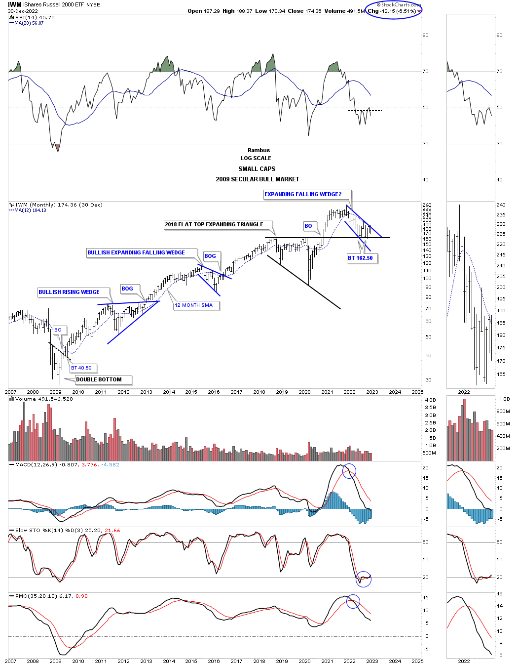
YEARLY: A new lower yearly low.
US DOLLAR MONTHY 1: Testing critical support.

US DOLLAR MONTHLY 2:
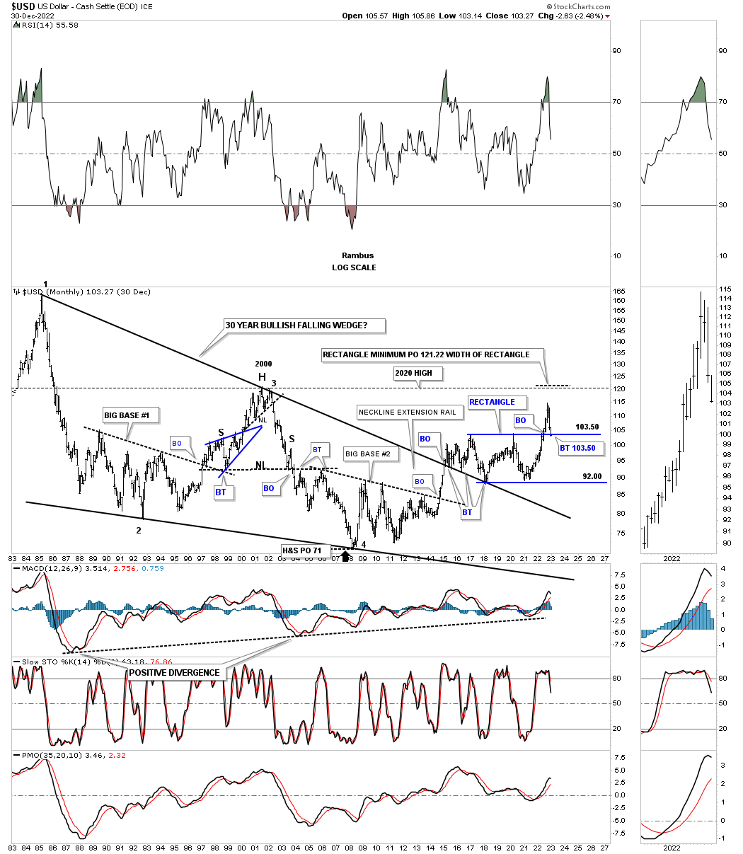
US DOLLAR YEARLY: Backtest in progress? A decent gain for the year.
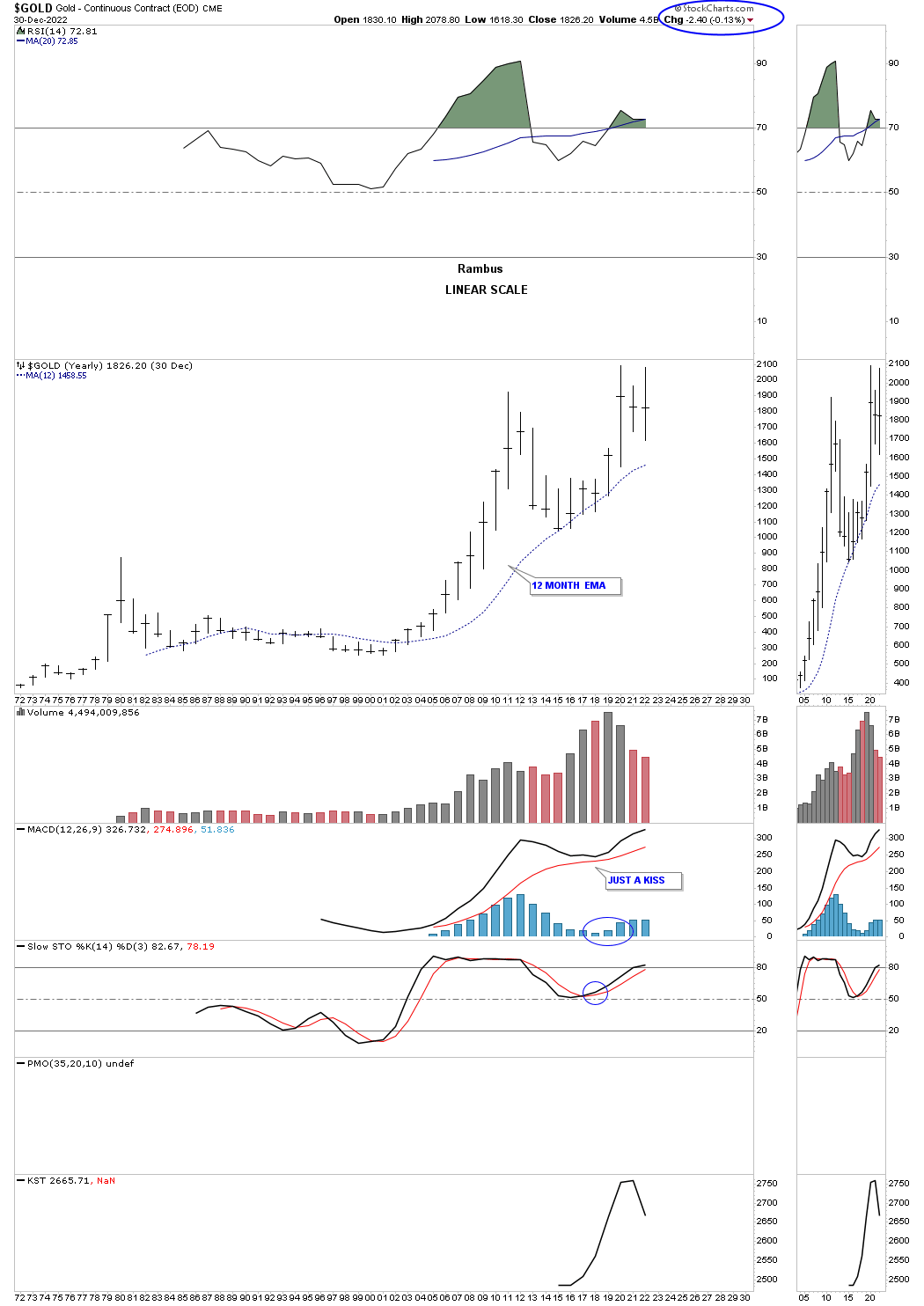
GOLD MONTHLY: Closed above both the 10 and 20 month ema for a long term buy signal. More confirmation will be made when the 10 month crosses above the 20 month ema.
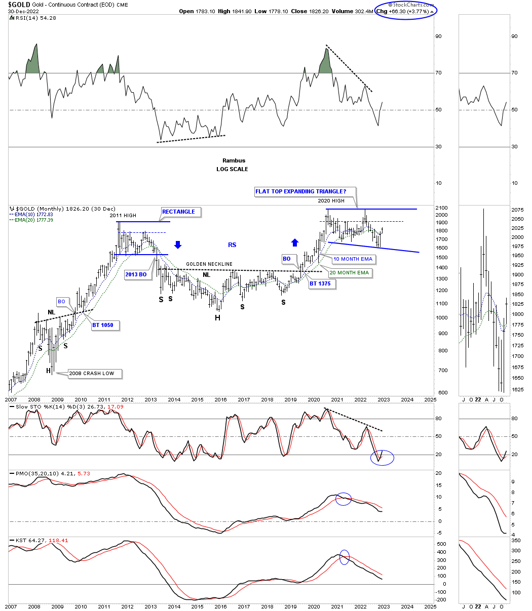
QUARTERLY:

GOLD YEARLY: Virtually no change for the year.
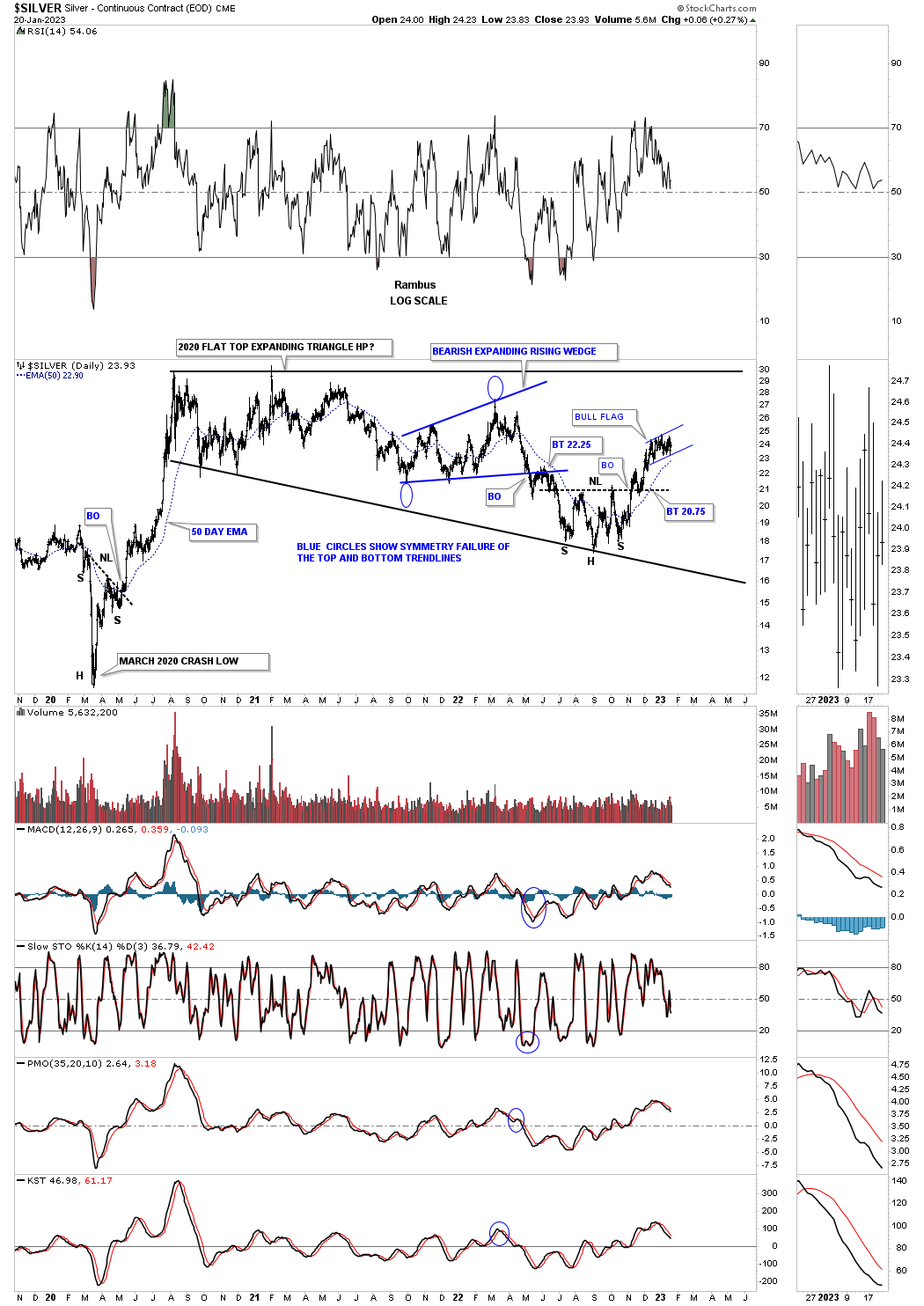
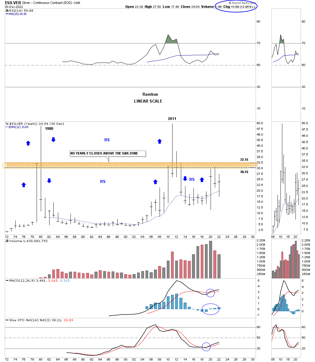
SILVER MONTHLY: Finding support on top of the 2016 triangle.
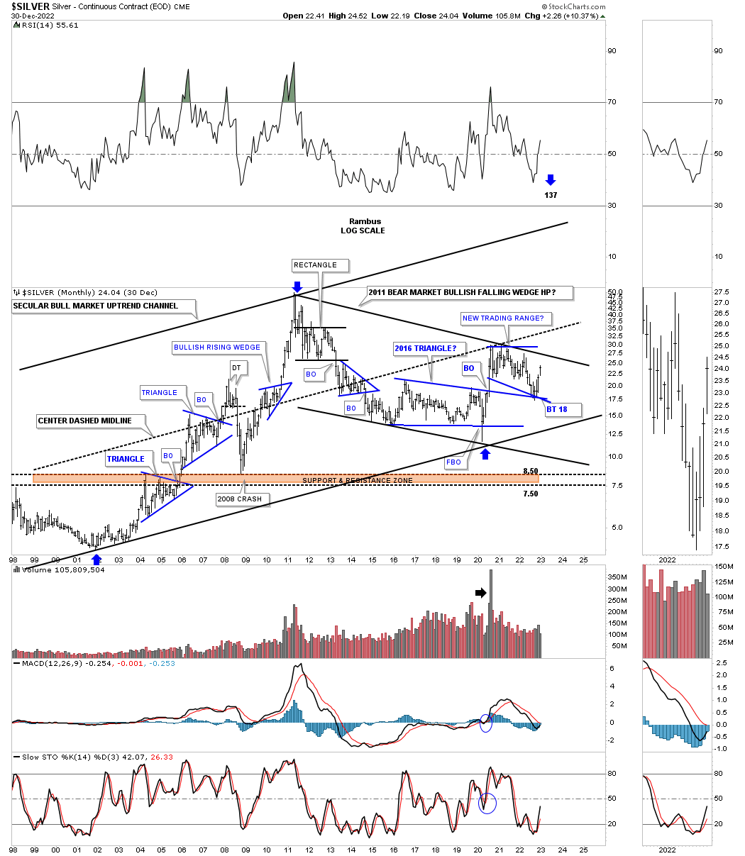
SILVER MONTHLY LINE: H&S consolidation pattern coming back to life after breaking below the neckline symmetry line?
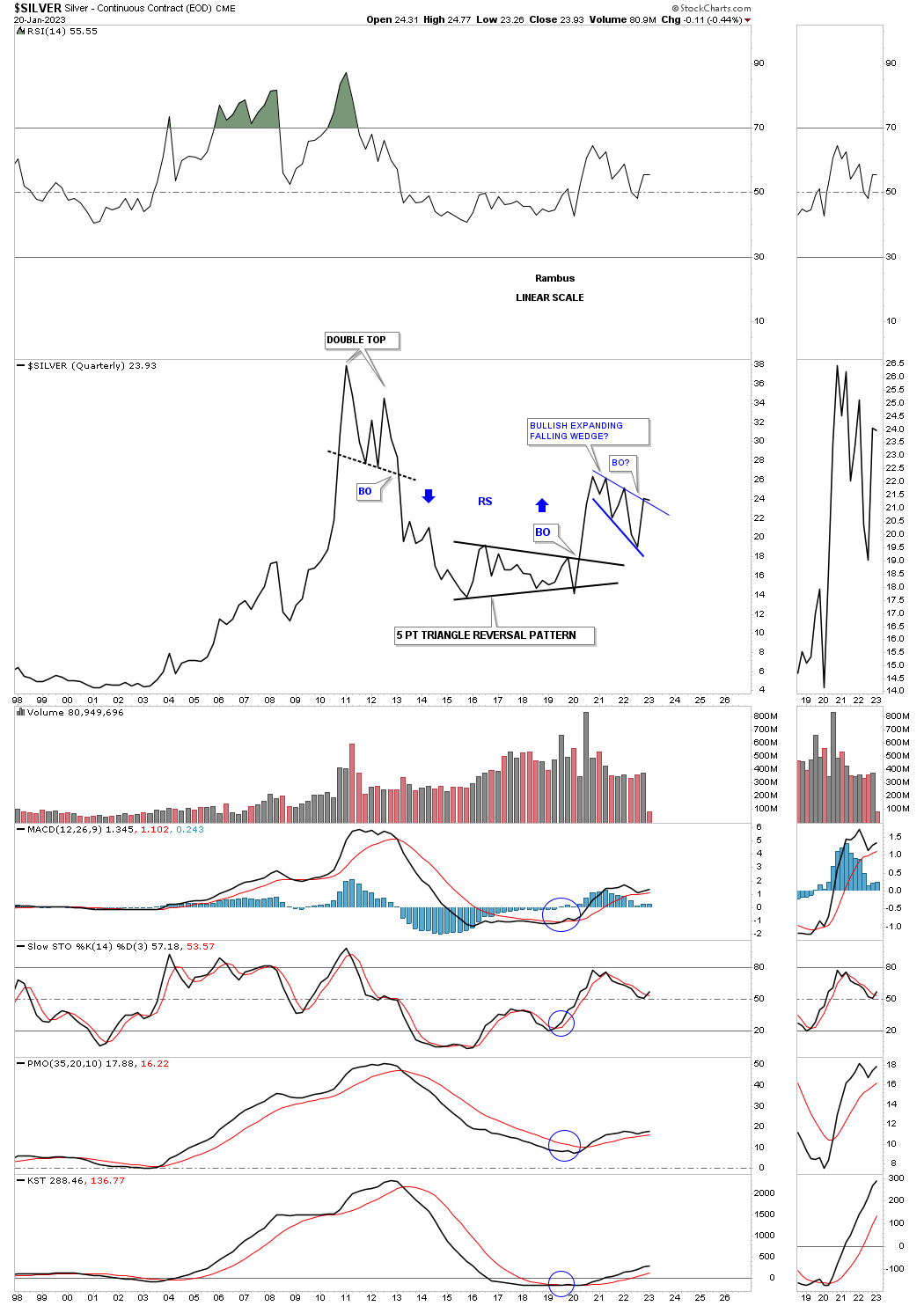
QUARTERLY 1: Secular bull market uptrend channel.

QUARTERLY 2: Line chart showing a possible bullish expanding falling wedge?
YEARLY: A slight gain for the year.
GDX MONTHY: Testing the 2013 S&R line from below.
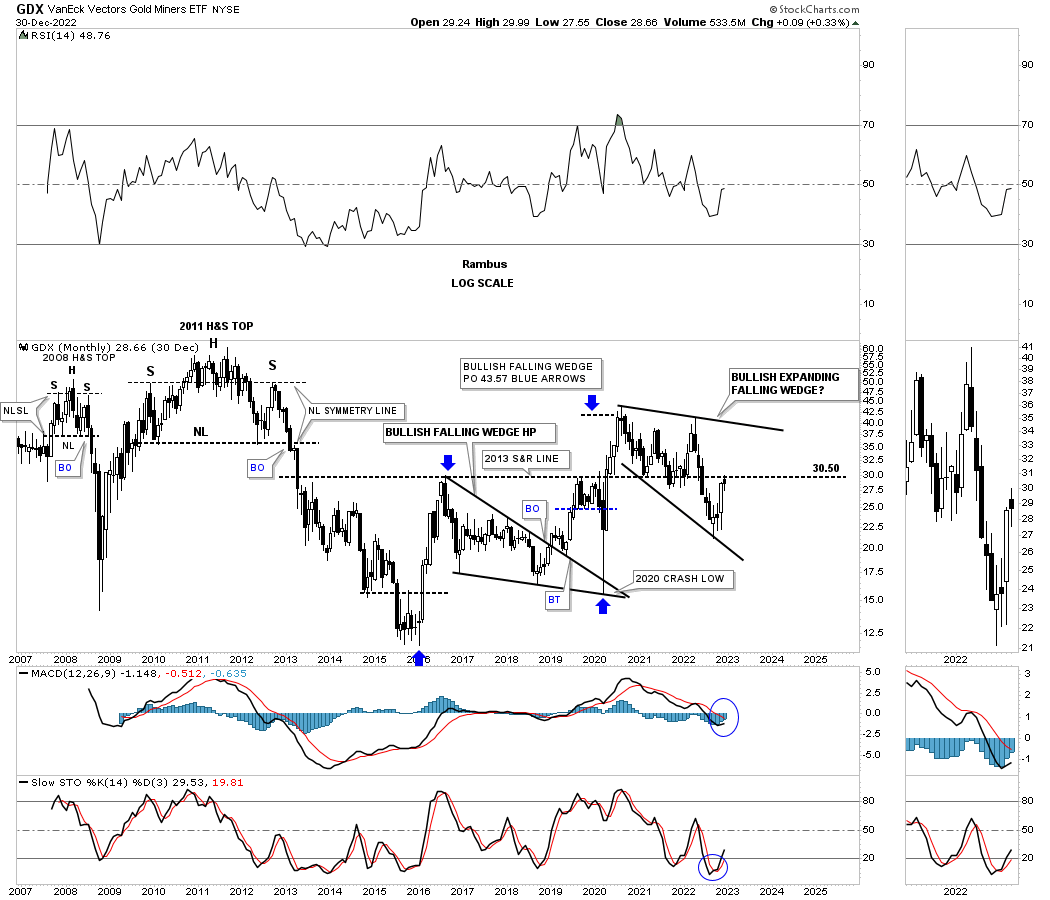
GDX MONTHLY: 2016 Uptrend channel.
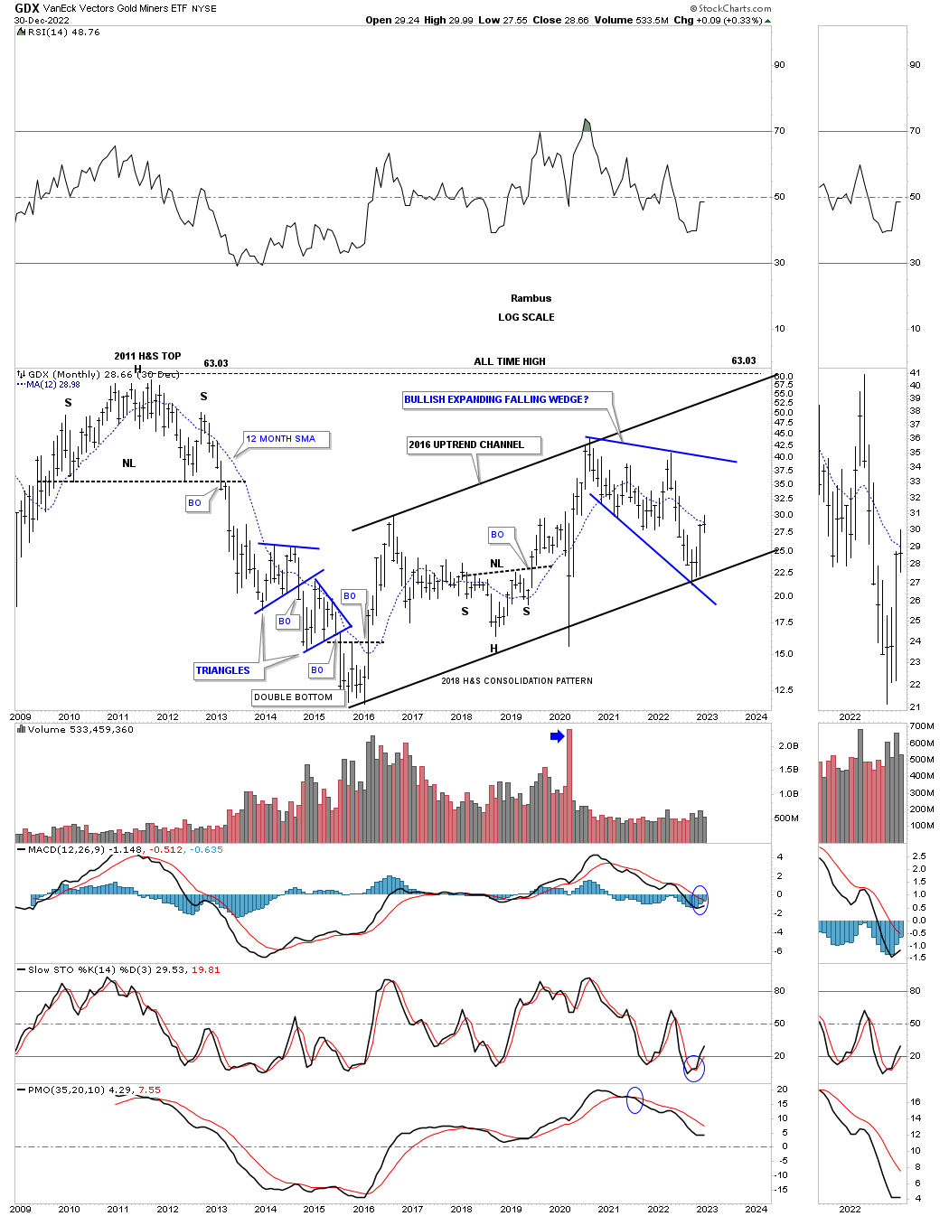
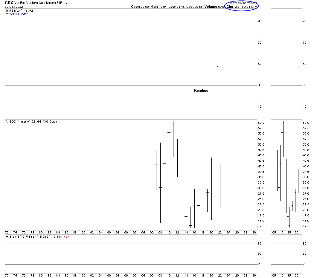
YEARLY: Down for the year.
GDXJ MONTHY: A potentail bearish chart.
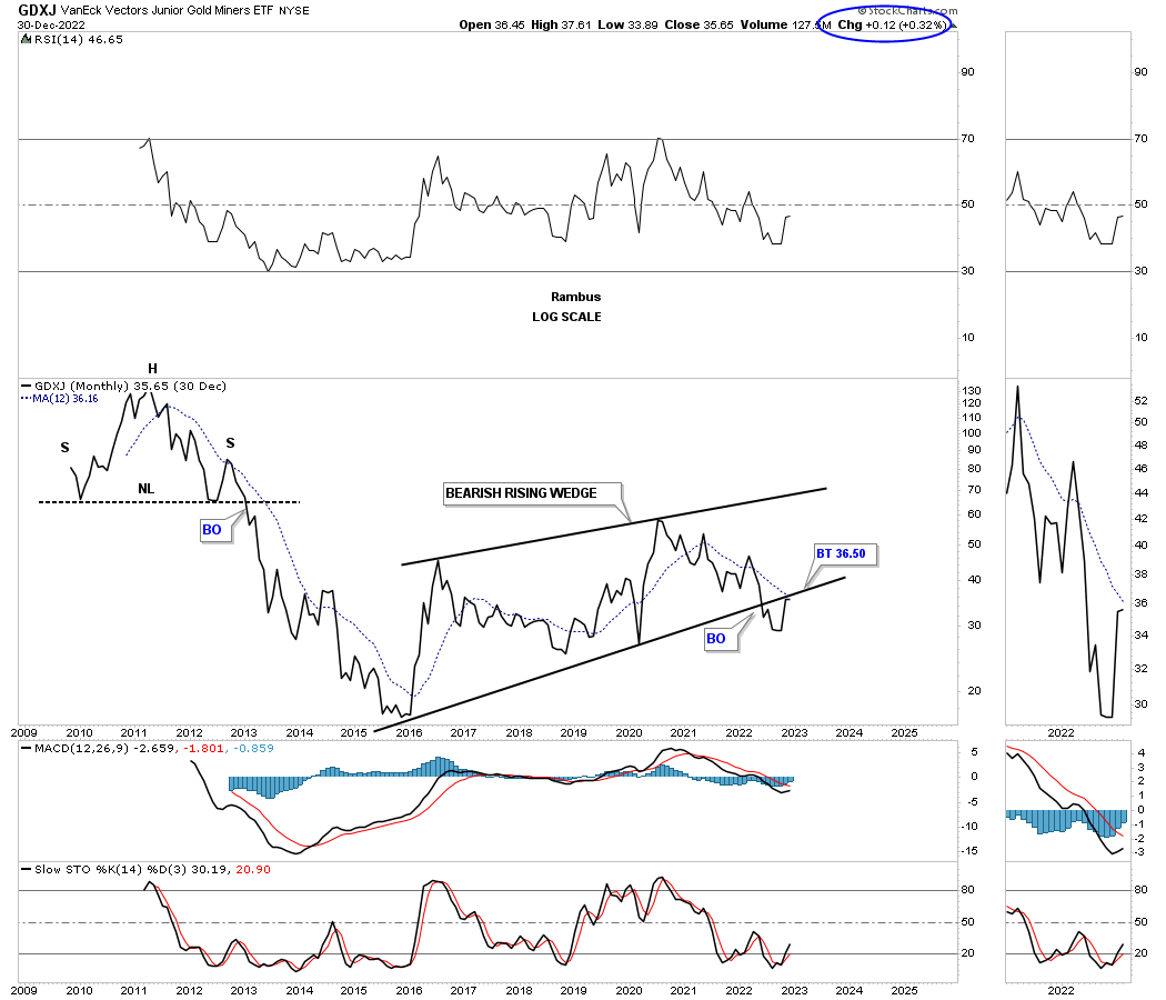
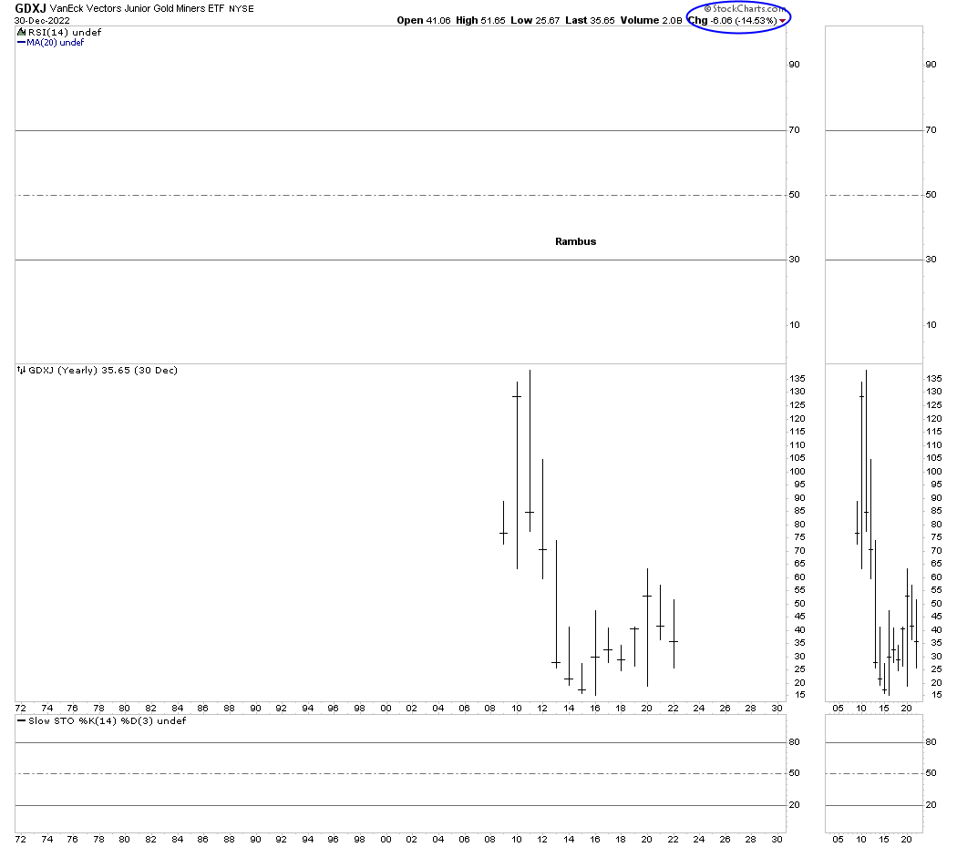
YEARLY: Down for the year.
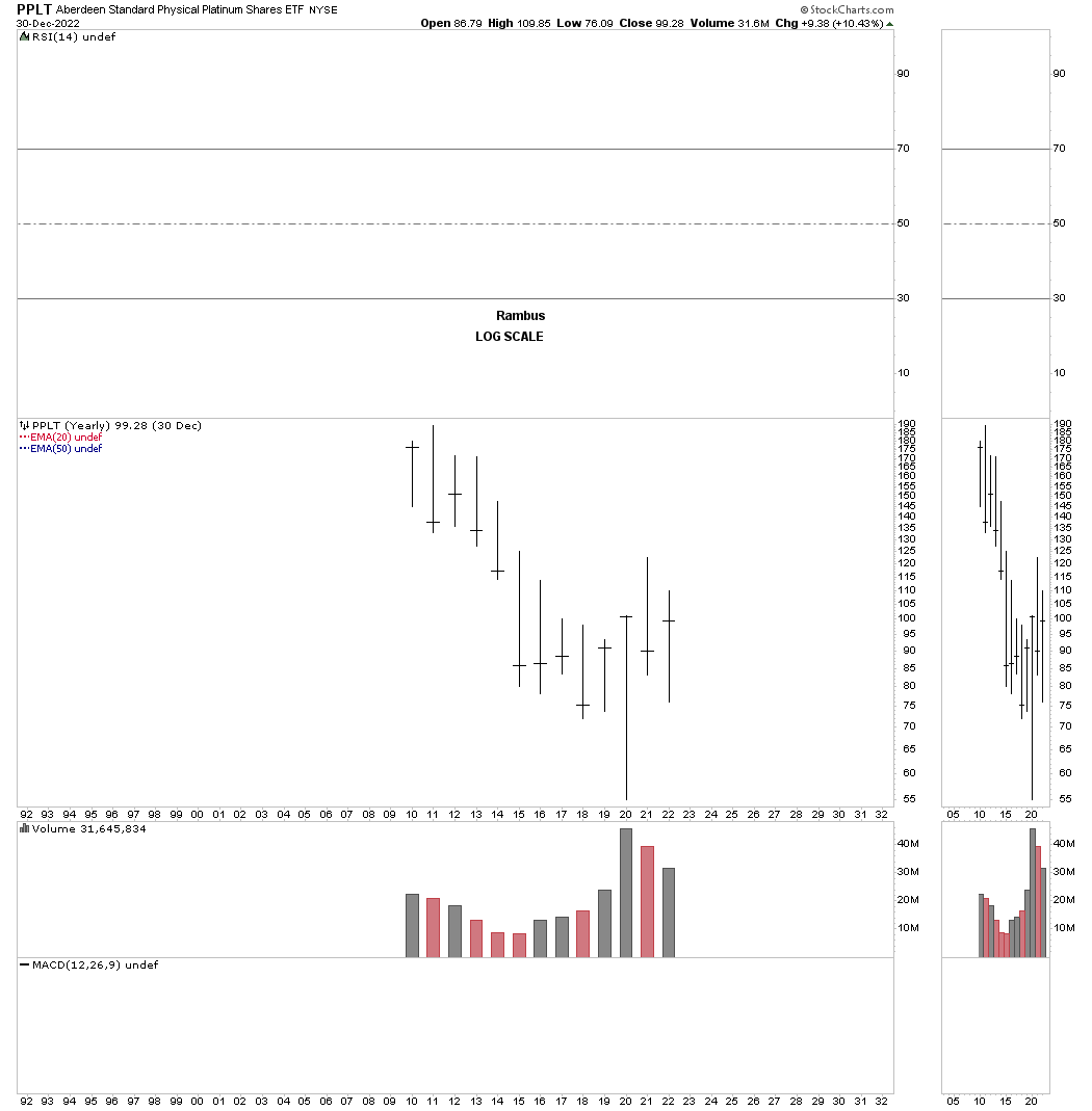
PPLT WEEKLY: Trying to breakout.
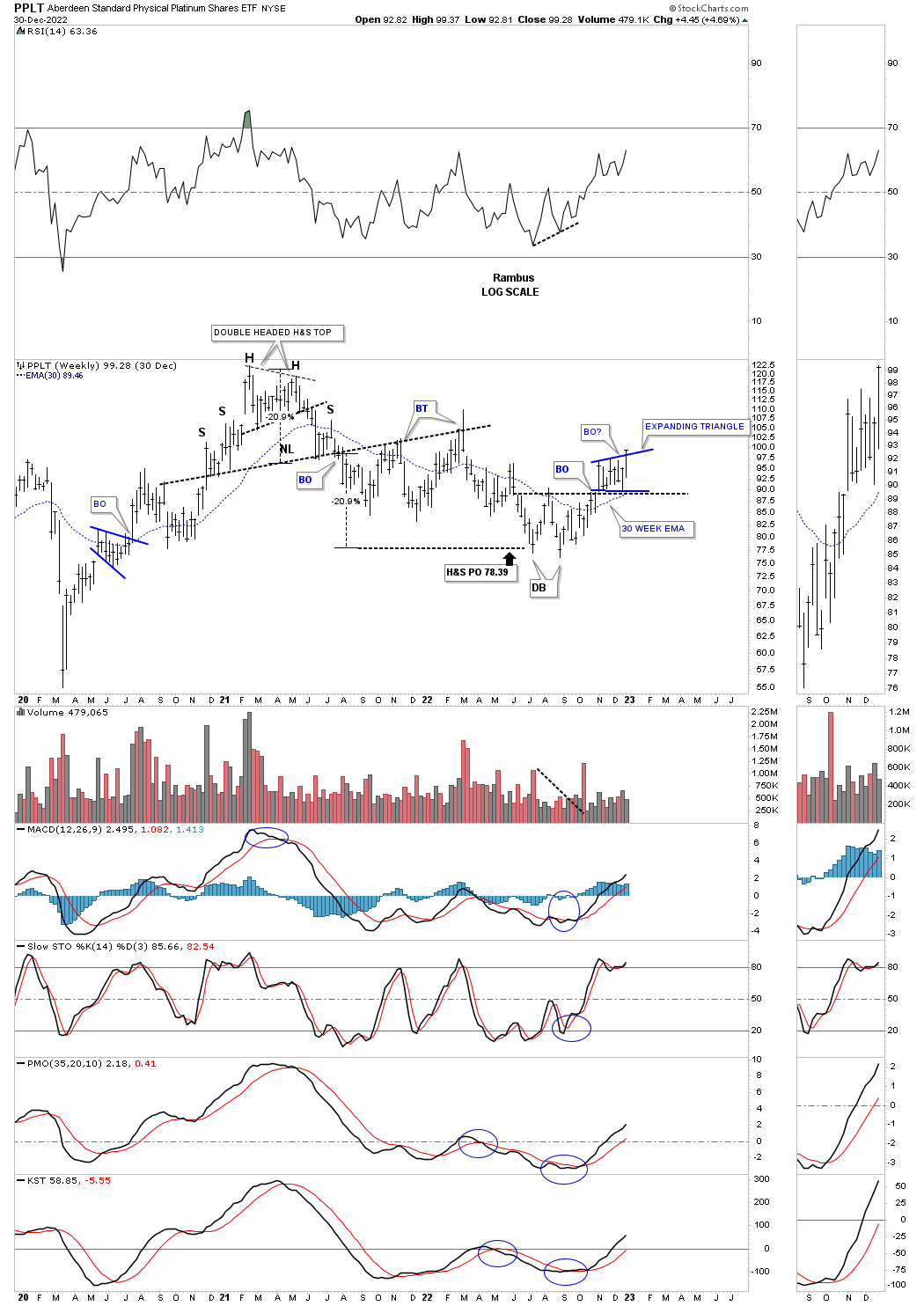
MONTHY: Testing overhead resistance.
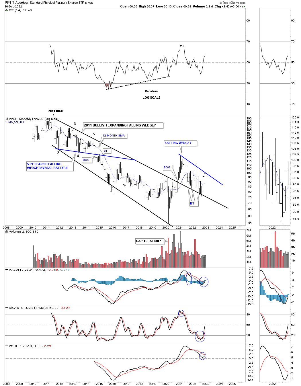
PPLT YEARLY: Up for the year.
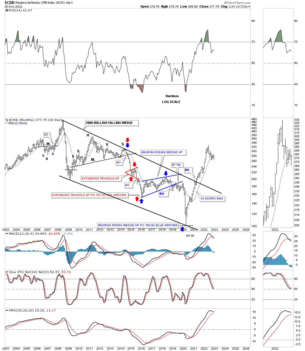
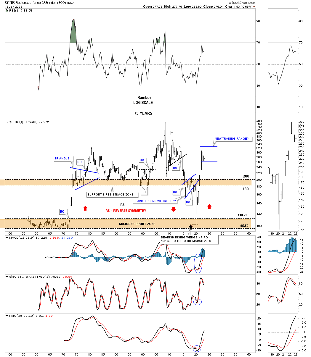
CRB MONTHLY: Could use a rest to consolidate its gains.
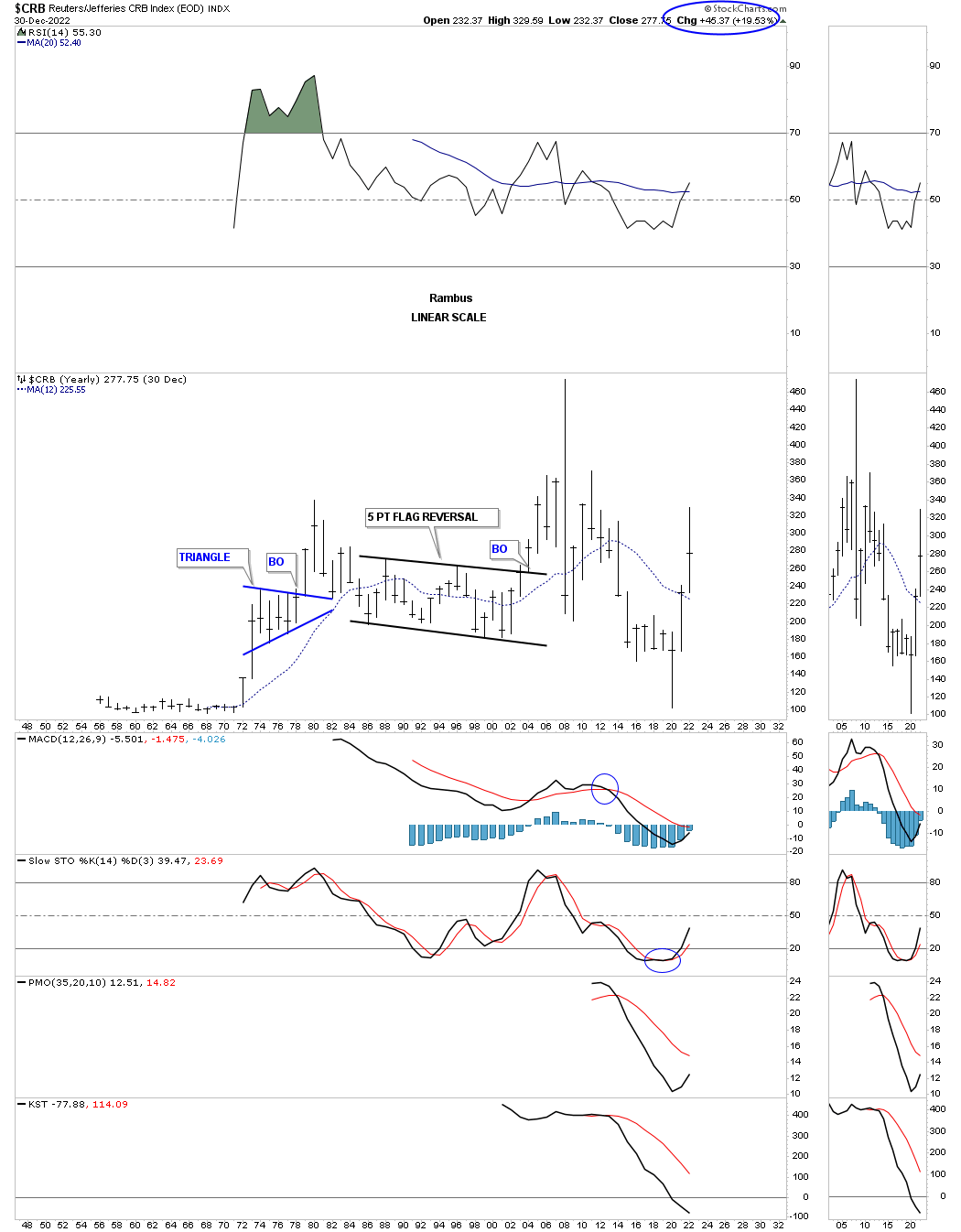
CRB YEARLY: One of the best performing areas in the markets this year.
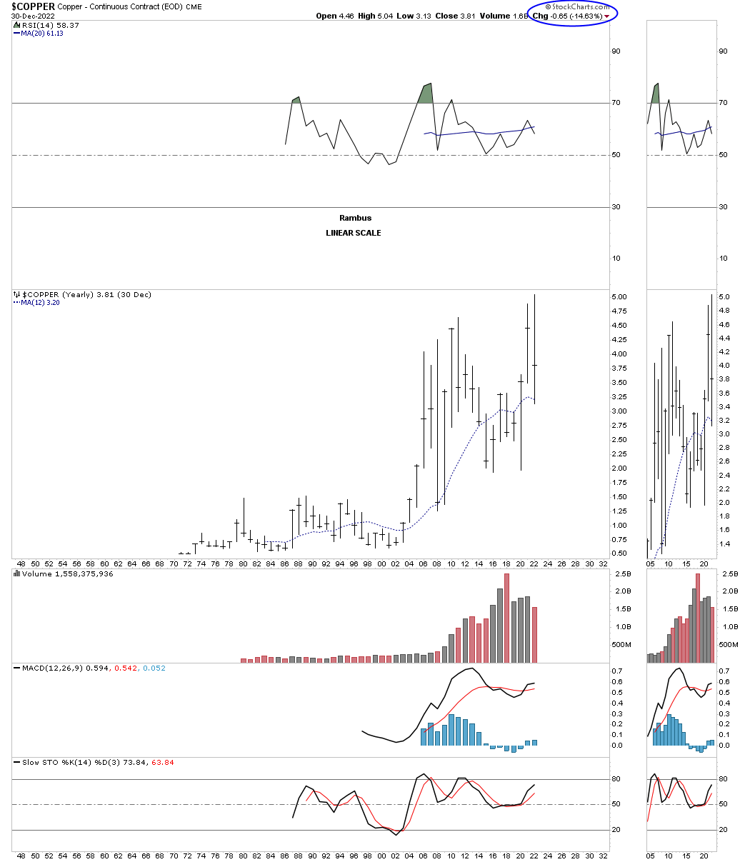
COPPER MONTHLY: Backtesting NL.
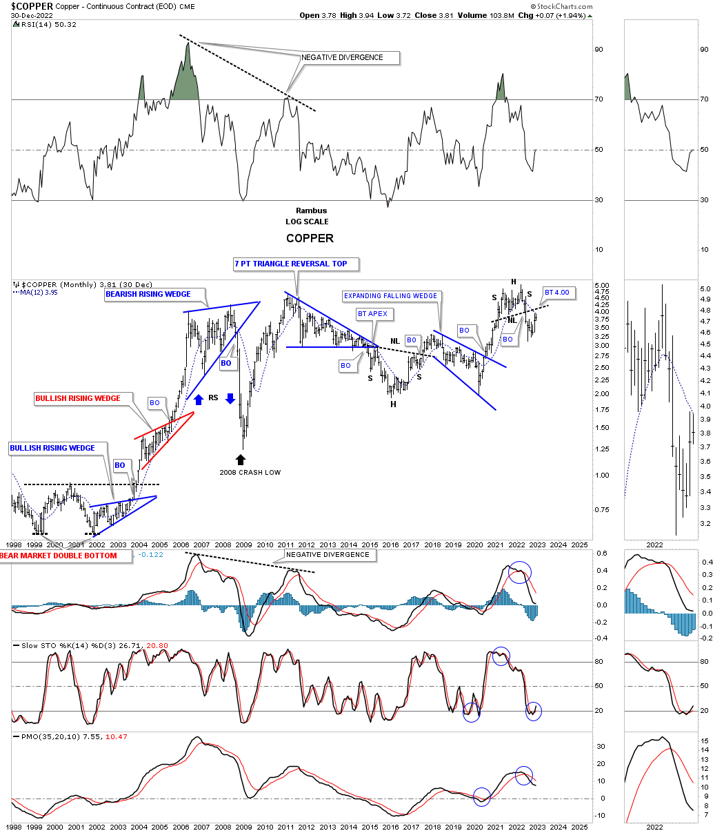
COPPER YEARLY: Down for the year.
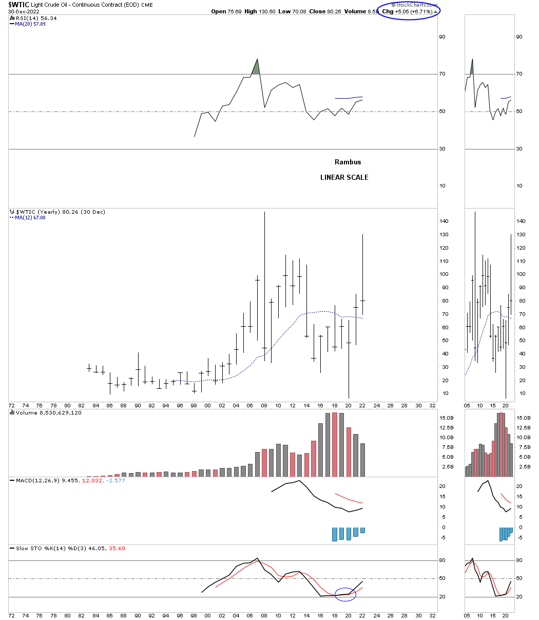
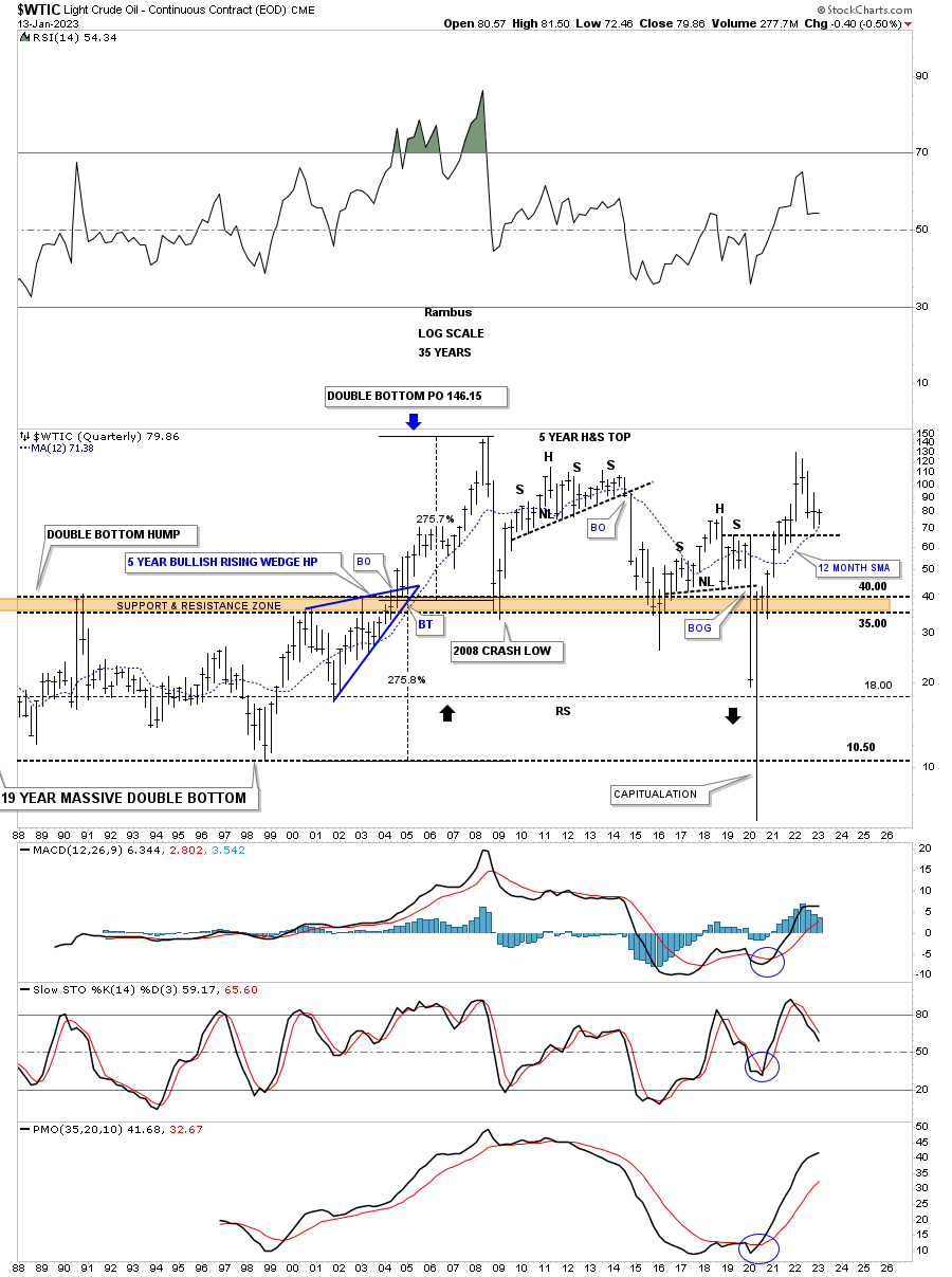
WITC MONTHLY: Possibly testing support?
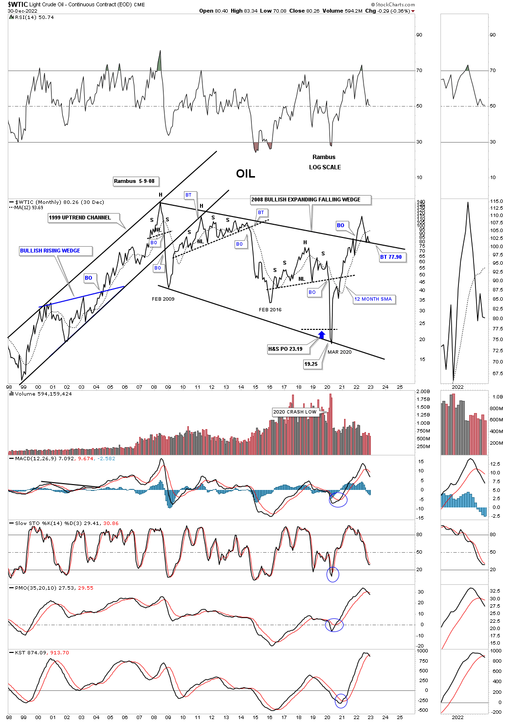
YEARLY: A massive three year bar trading range.
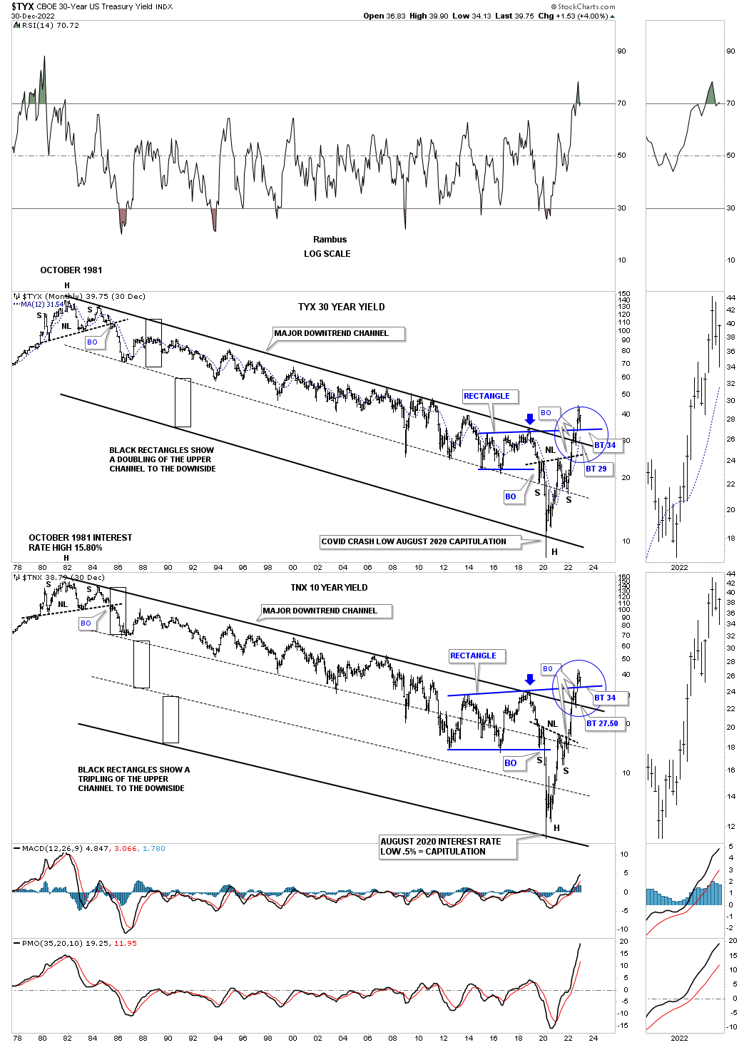
TNX YEARLY: One of the biggest movers this year.
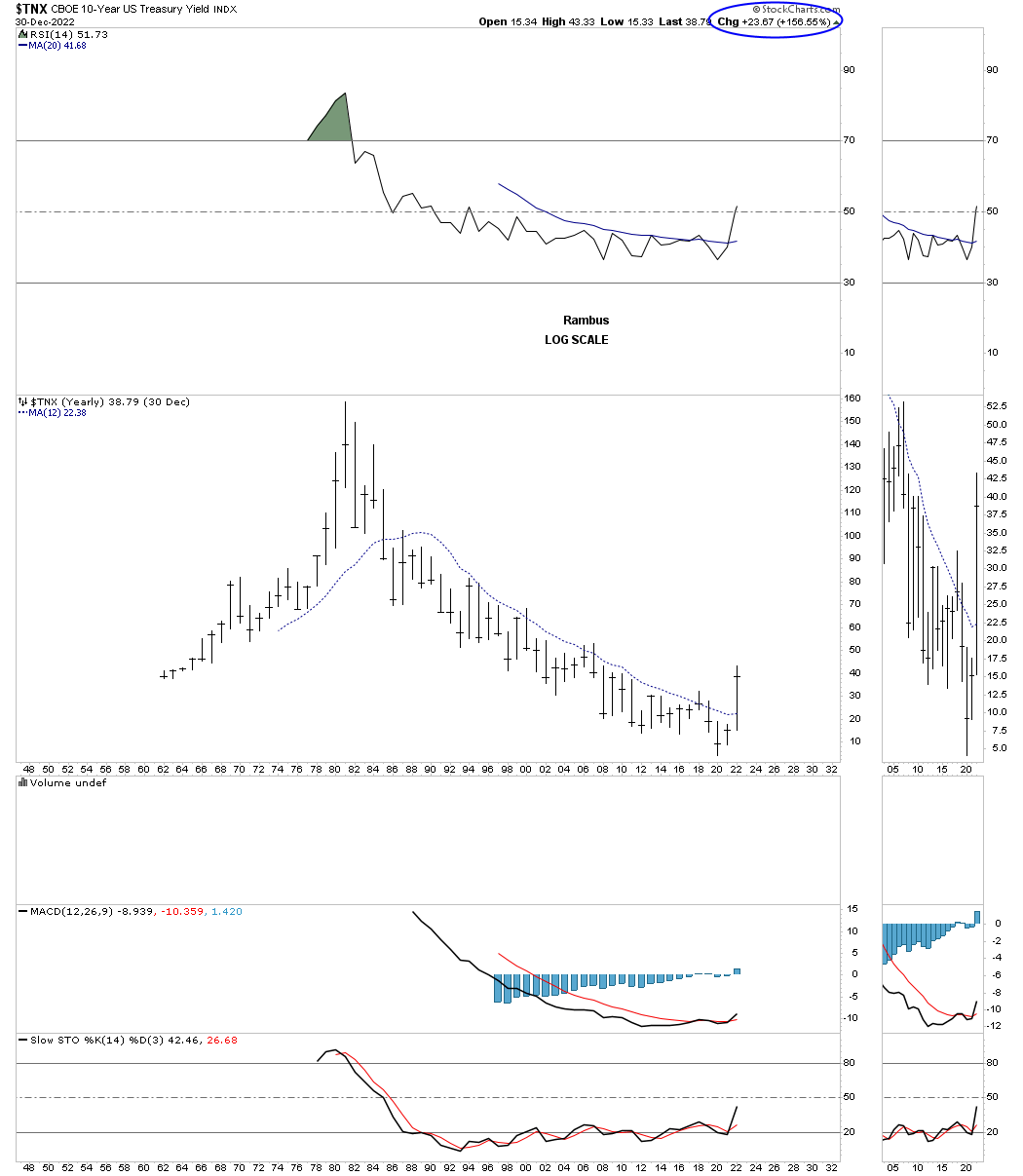
TYX – TXN MONTHLY COMBO CHART: Both have been in backtest mode after breaking out from the top rail of the massive downtrend channel and the top rail extension line of the blue rectangle. Note the capitulation move into the bear market low which then formed the H&S bottom and the H&S top that started this massive decline back in the early 1980’s.
All in all it was a pretty tough year for investors with only a few areas to place ones capital. There are several different possibilities going into 2023. First, the US stock markets could be starting a secular bear market that will last many years with the occasional cyclical bull market. Second, a bottom could form and the 2022 correction could end up being a consolidation pattern and the secular bull market remains intact. The third scenario could be that we are at the beginning of a very large trading range similar to the 1970’s and the 2000’s trading ranges you can see on the quarterly chart for the SPX and the INDU.
Whichever possibility unfolds the Chartology should help us in identifying important reversal patterns at the reversal points in whatever trading range builds out. I’m looking forward to whatever the markets give us to work with in 2023 which I suspect will be a very interesting and volatile year. All the best…Rambus
Commodities
Most commodities were in a severe bear market until everything crashed in the spring of 2020 including the PM complex and the US stock markets. What followed next was one of the strongest bull runs in just about everything that crashed. After about two years of strong price action everything needed a rest to consolidate their gains which brings us up to the present.
As you will see on many of the charts to follow the correction or consolidation phase is underway which could take some time to complete because the nearly two year rally was so massive. That leaves the door open for a possible one or two year trading range setting up which we may be able to take advantage of by trading the reversal points within the new trading ranges.
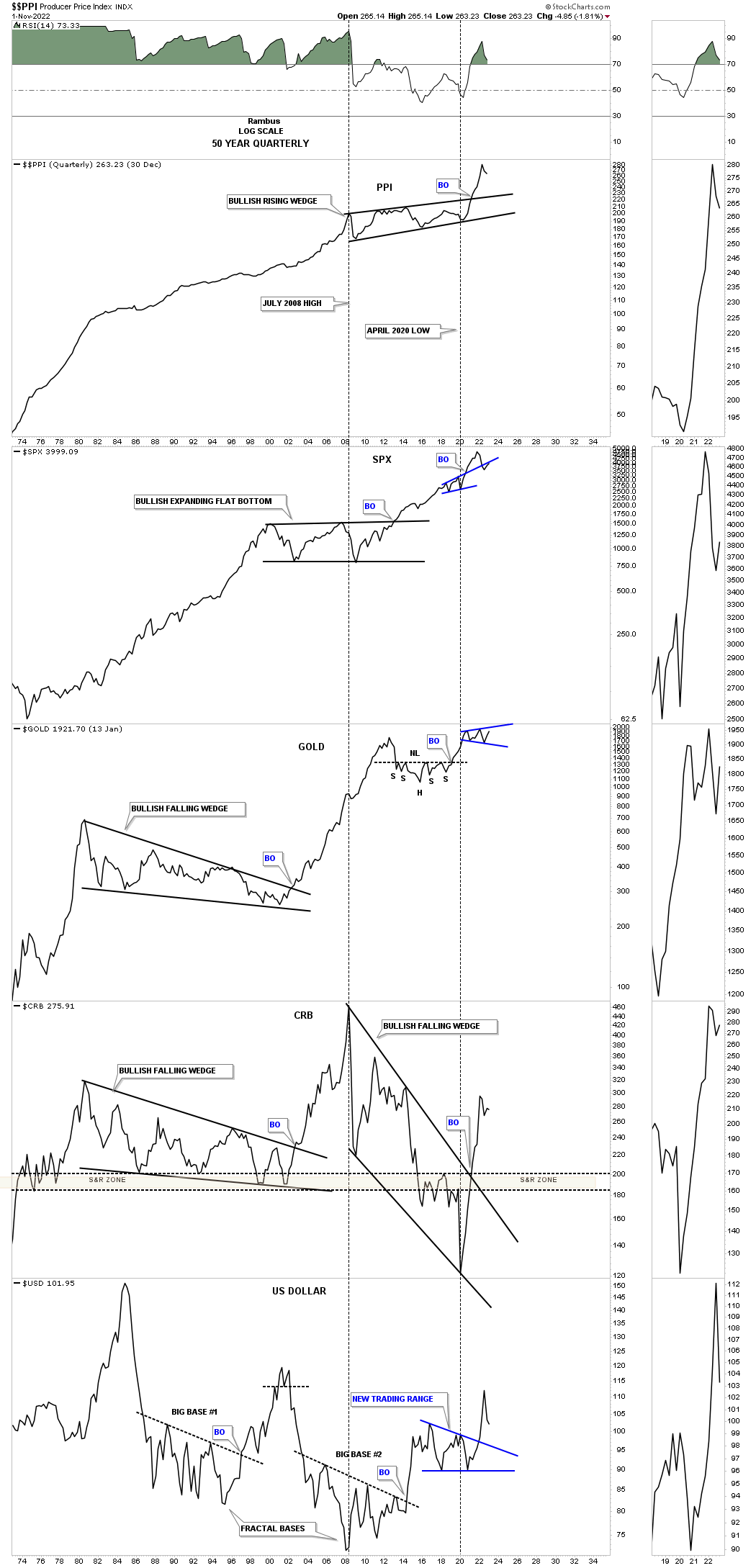
Lets start with the 50 year quarterly combo chart which has the PPI on top followed by the SPX, Gold, CRB index with the US dollar on the bottom. The PPI shows that inflation is just part of the world we live in as a long term secular trend that will likely persist on a relative basis for years to come. For the most part the SPX doesn’t seem to mind inflation as it has been moving higher over the very long term. Gold has also moved higher along with inflation for the most part. The CRB index is a little different as its 2008 to 2020 correction was quite strong until it finally bottomed and then caught fire in 2020 and moved vertical not wasting any time catching up to the rest of the commodities complex. The US dollar on the bottom generally moves inverse to commodities, but there are times when the CRB index and the US dollar can move together for periods of time.
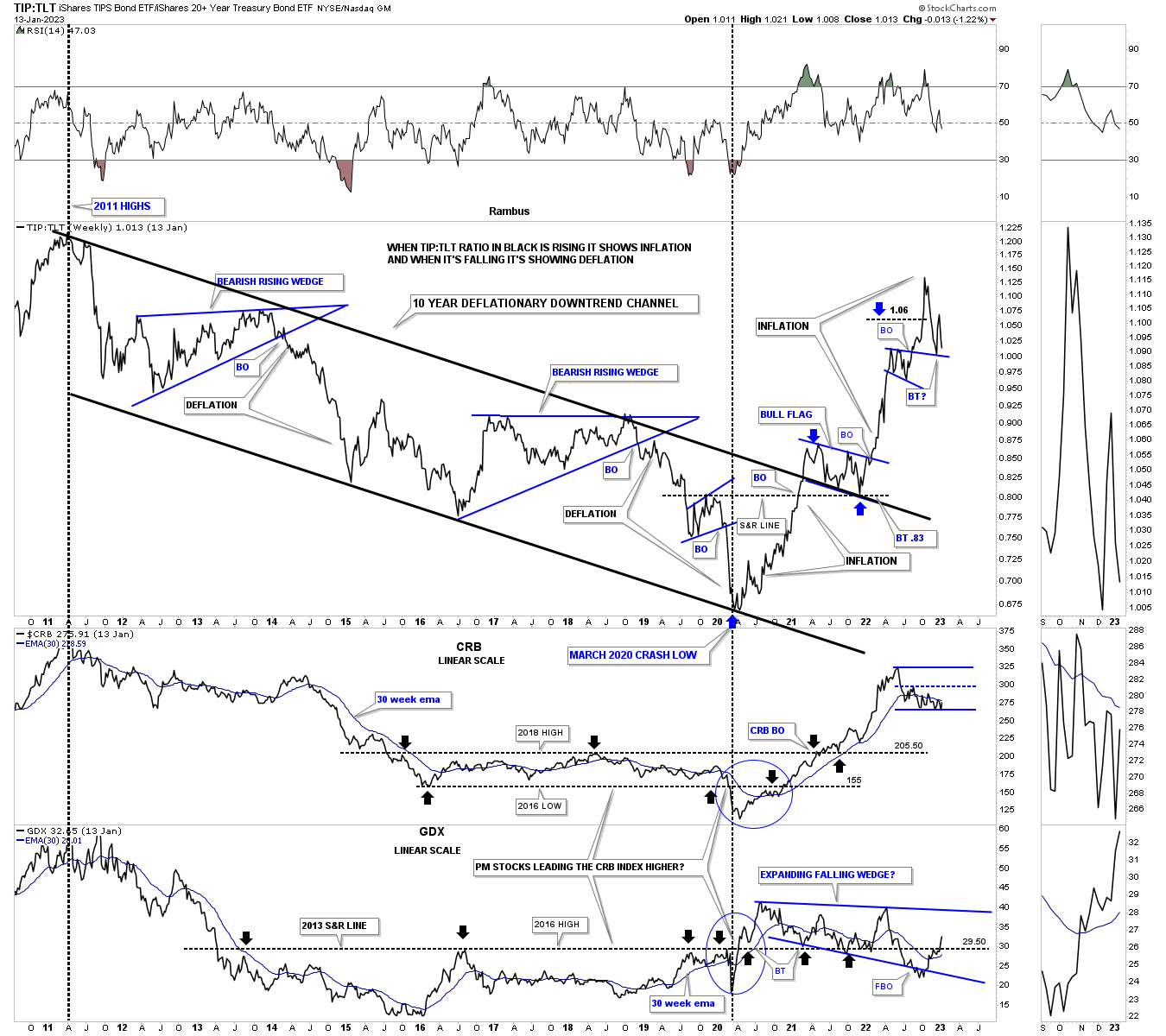
Next is the ratio combo chart which has the TIP:TLT ratio chart on top with the CRB index and GDX on the bottom. I use the ratio chart on top to help gauge if inflation or deflation has the upper hand. From the 2011 high to the 2020 low deflation was in control with bouts of of mild inflation as shown by the blue trading ranges within the parallel downtrend channel. The magnitude of the rally out of the 2020 low on the ratio chart was pretty impressive which shows that inflation has come back into play. After such a strong rally we should expect to see the ratio chart on top start to consolidate.
Note that massive rally the CRB index had just below the ratio chart. It too could use some time to consolidate its gains which could be starting to form a new trading range. The GDX on the bottom has been much weaker off the 2020 low, but has been forming a very large consolidation pattern that won’t be completed until the top trendline is broken. A week or two ago you can see the GDX finally traded back above that massive S&R line at 29.50 which extends all the way back to 2013.
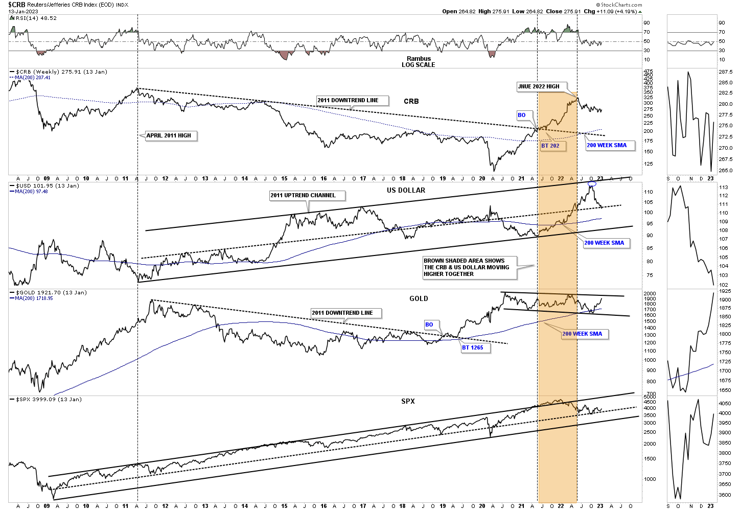
Next is a triple combo chart which has the CRB index on top followed by the US dollar, Gold and the SPX. It is easy to see that massive rally the CRB index had off the 2020 crash low which ended its bear market and could use some time to digest those gains. The US dollar bounced off the top rail of its uptrend channel and is now testing the center dashed midline for possible support. Gold has been just been chopping sideways in a slow methodical style while the SPX has been trending higher since the 2009 crash low. The brown shaded area shows how the CRB and the US dollar rallied together before the CRB finally topped out with the US dollar rallying for a few more months before it finally started to correct.
Lets now look at some of the different commodity indexes to put that nearly two year rally in perspective. First is the long term monthly chart for the CRB index which shows the massive two year rally out of the 2020 crash low which ended its bear market. As you can see it would make perfect sense to see some type of consolidation pattern start to form.
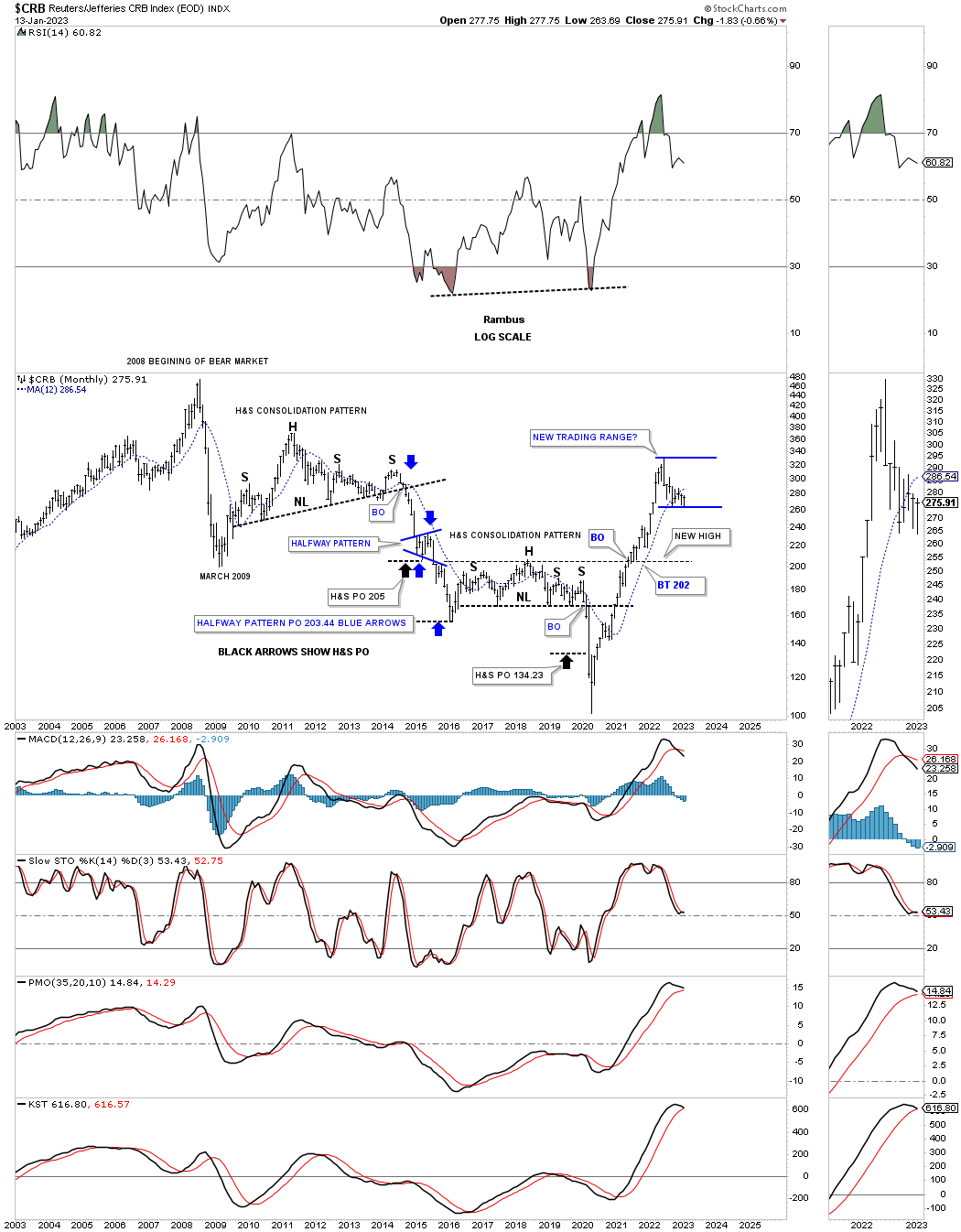
This quarterly history chart for the CRB index shows the vertical move up to the recent high and could be an area to start consolidating those gains, see the mid 1970’s triangle.
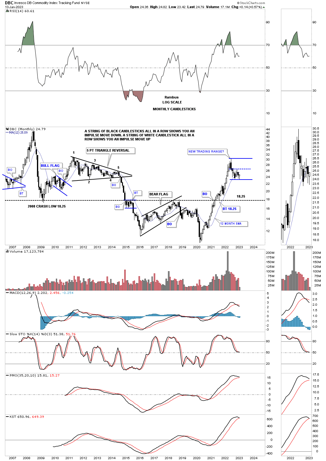
The DBC commodities index also shows the biggest rally in its history could be setting up a new trading range which would be healthy in the long term.
Next is a daily chart for Copper which broke out from a triangle consolidation pattern a week or two ago.
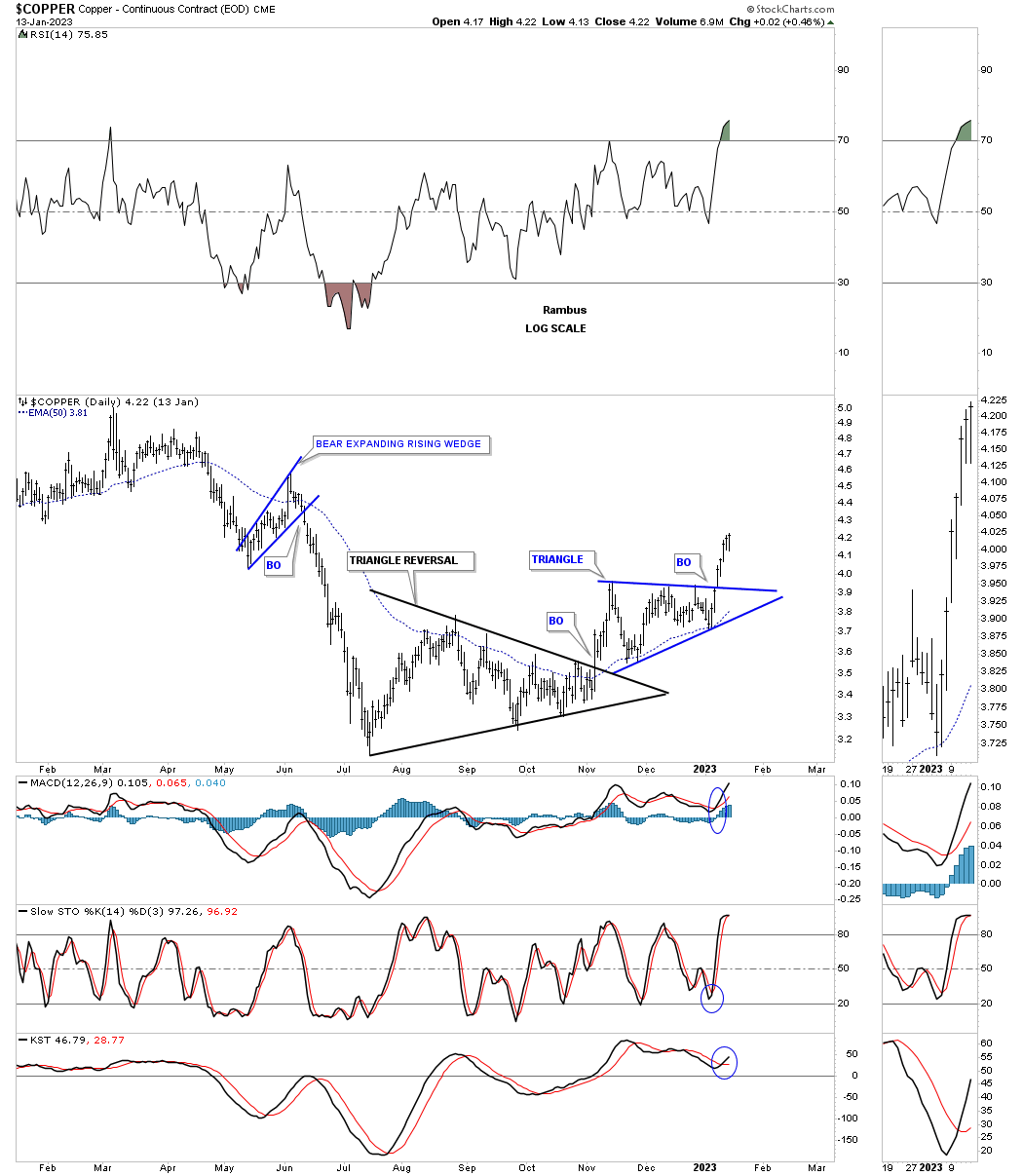
This weekly chart shows Copper forming a one year H&S top and reached the H&S top price objective in July of 2022. Since that low Copper has been in rally mode closing last week back above the neckline and the 30 week ema.
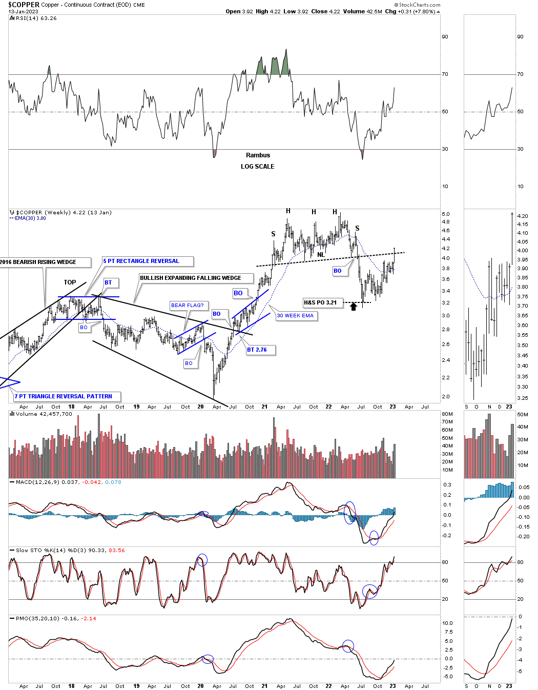
To put the daily and weekly charts in perspective below is the long term monthly chart showing how the daily and weekly charts could be setting up a new trading range which is a little further along than some of the other commodity indexes.
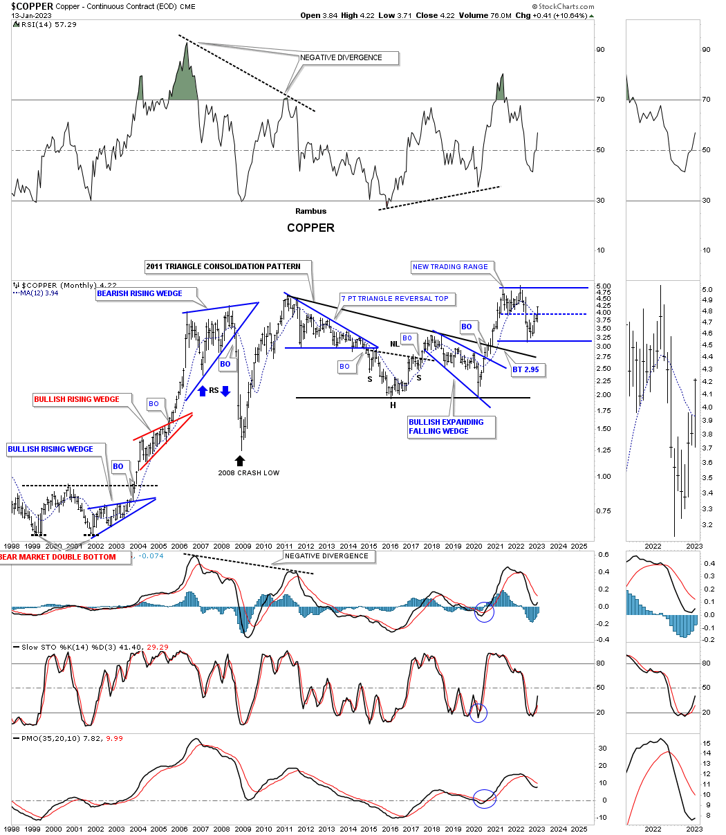
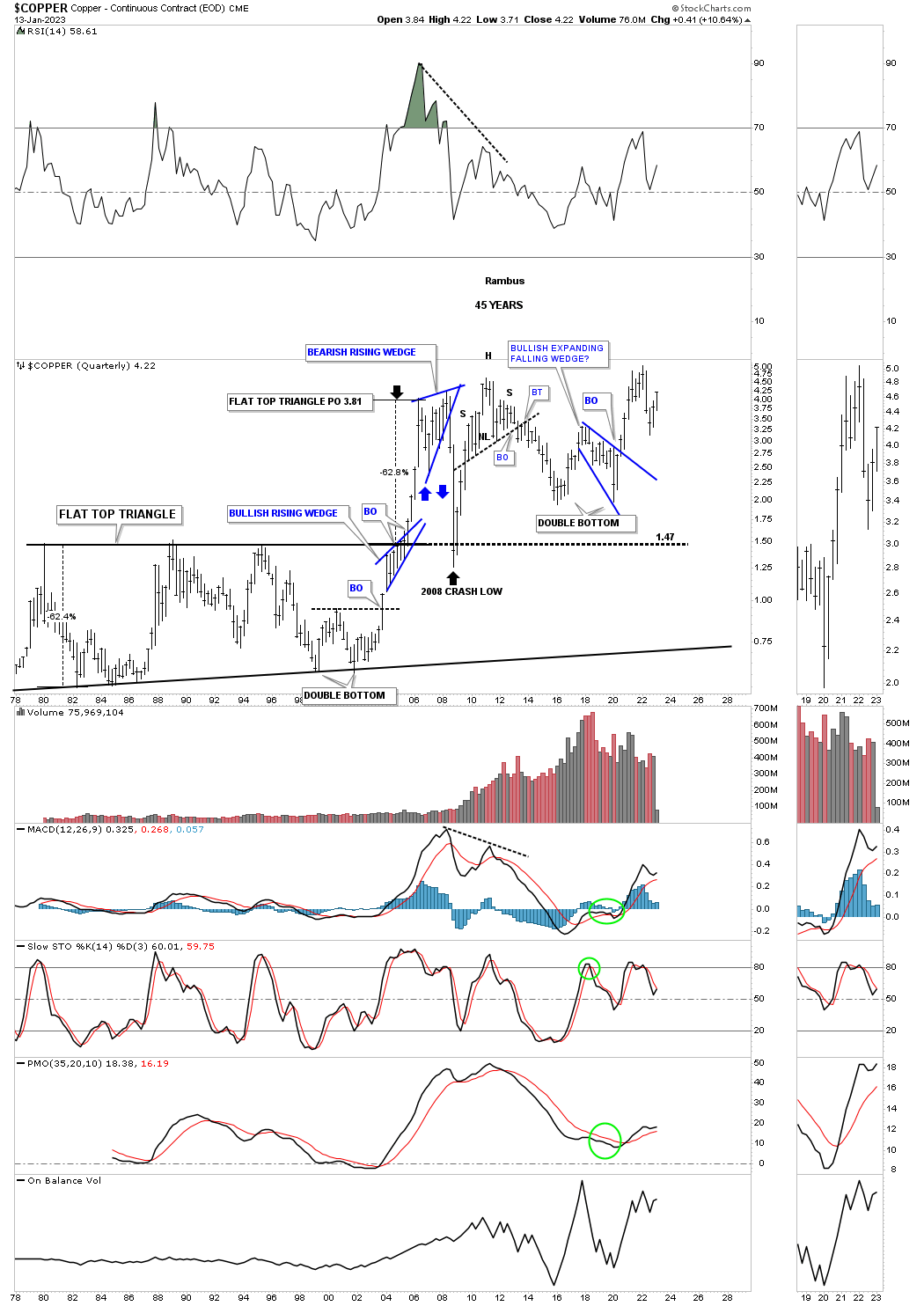
Copper quarterly chart for perspective.
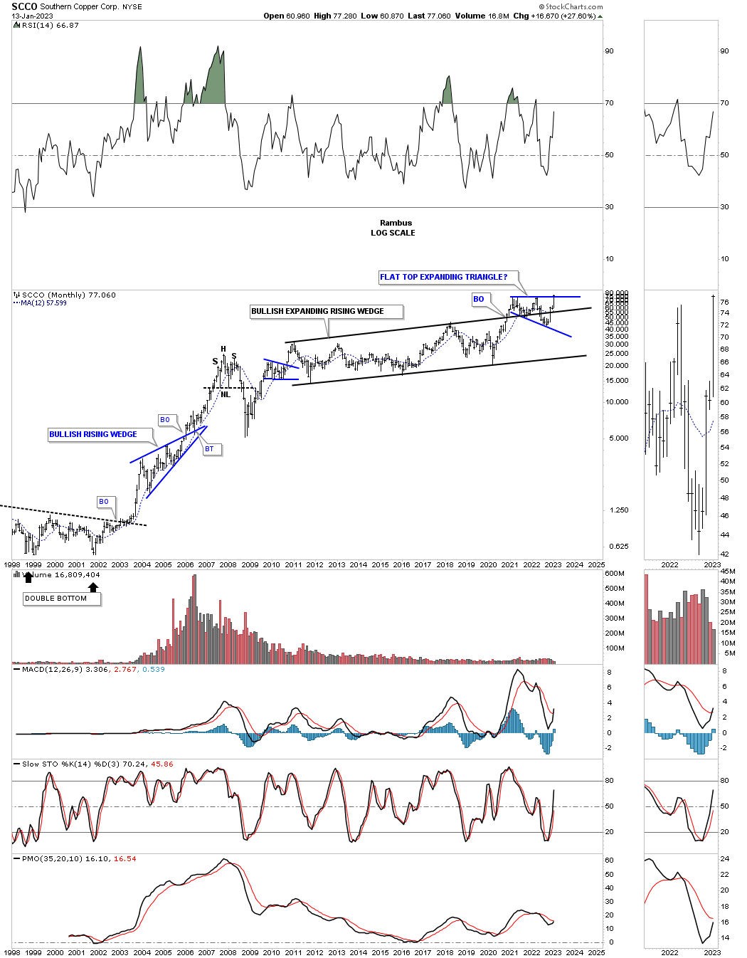
We’ve been following this monthly chart for SCCO for many years watching the expanding rising wedge forming. As you can see the price action has been forming the blue flat top expanding triangle as the backtest with the price action closing at a new all time high last week.
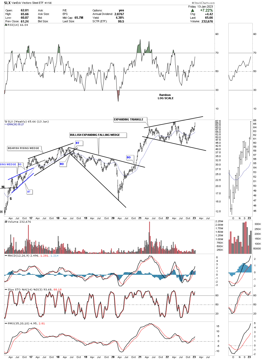
Steel has also been one of the stronger areas as shown by the SLX, steel etf, which has been building out an expanding triangle and is getting close to making a new all time high.
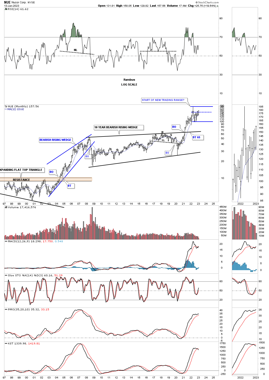
After breaking out from its massive bullish rising wedge in 2020 NUE has been consolidating those gains.
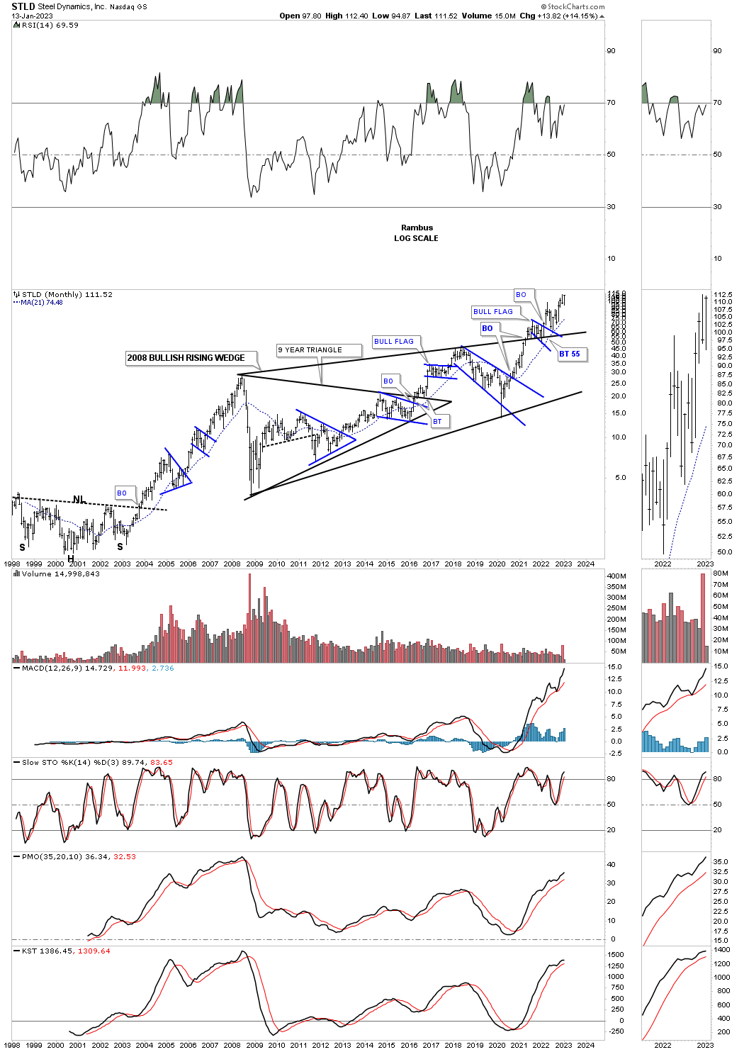
Last week one of the strongest steel stocks closed at a new all time high.
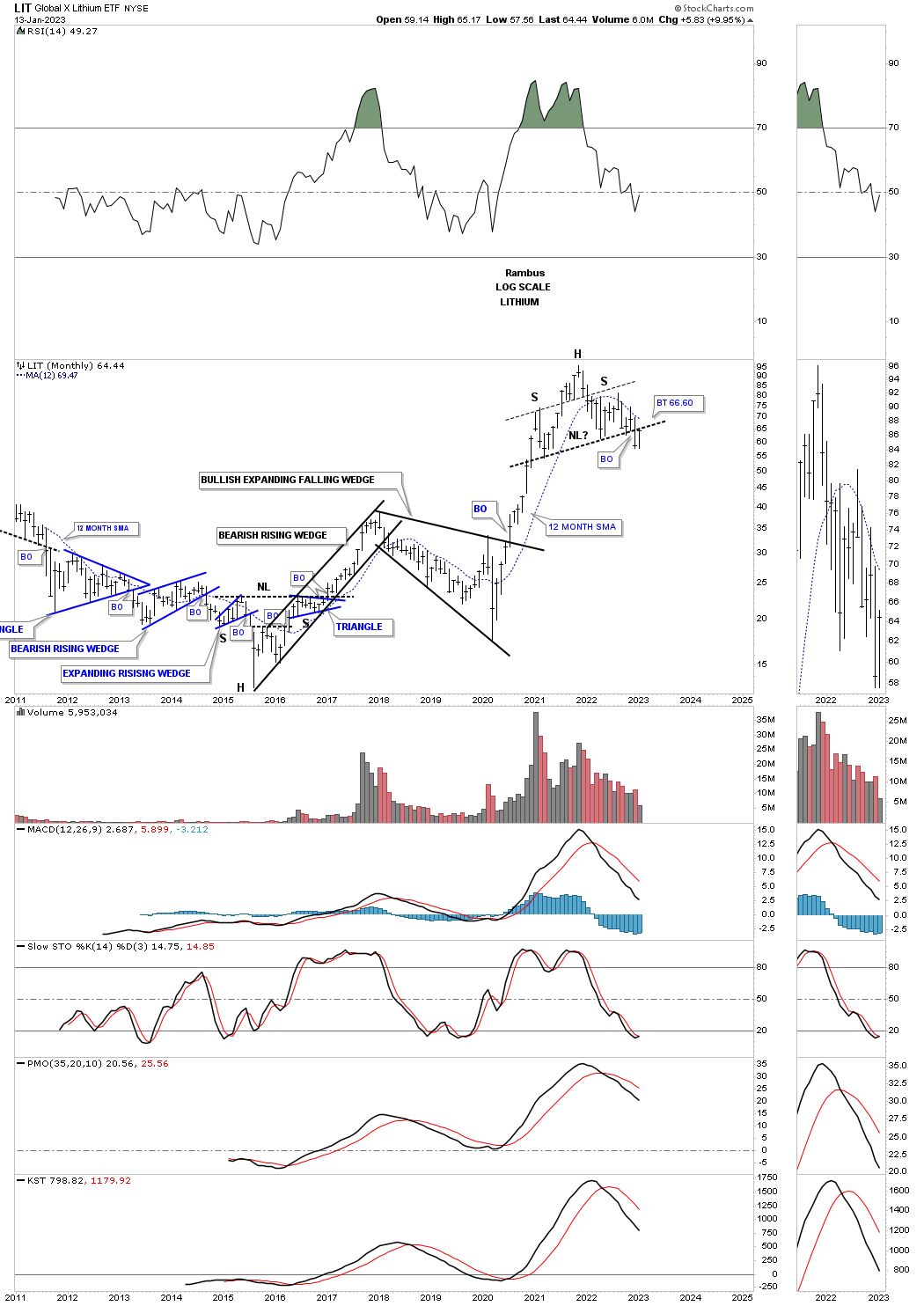
LIT on the other hand could be showing us a H&S top with a possible backtest this month in progress.
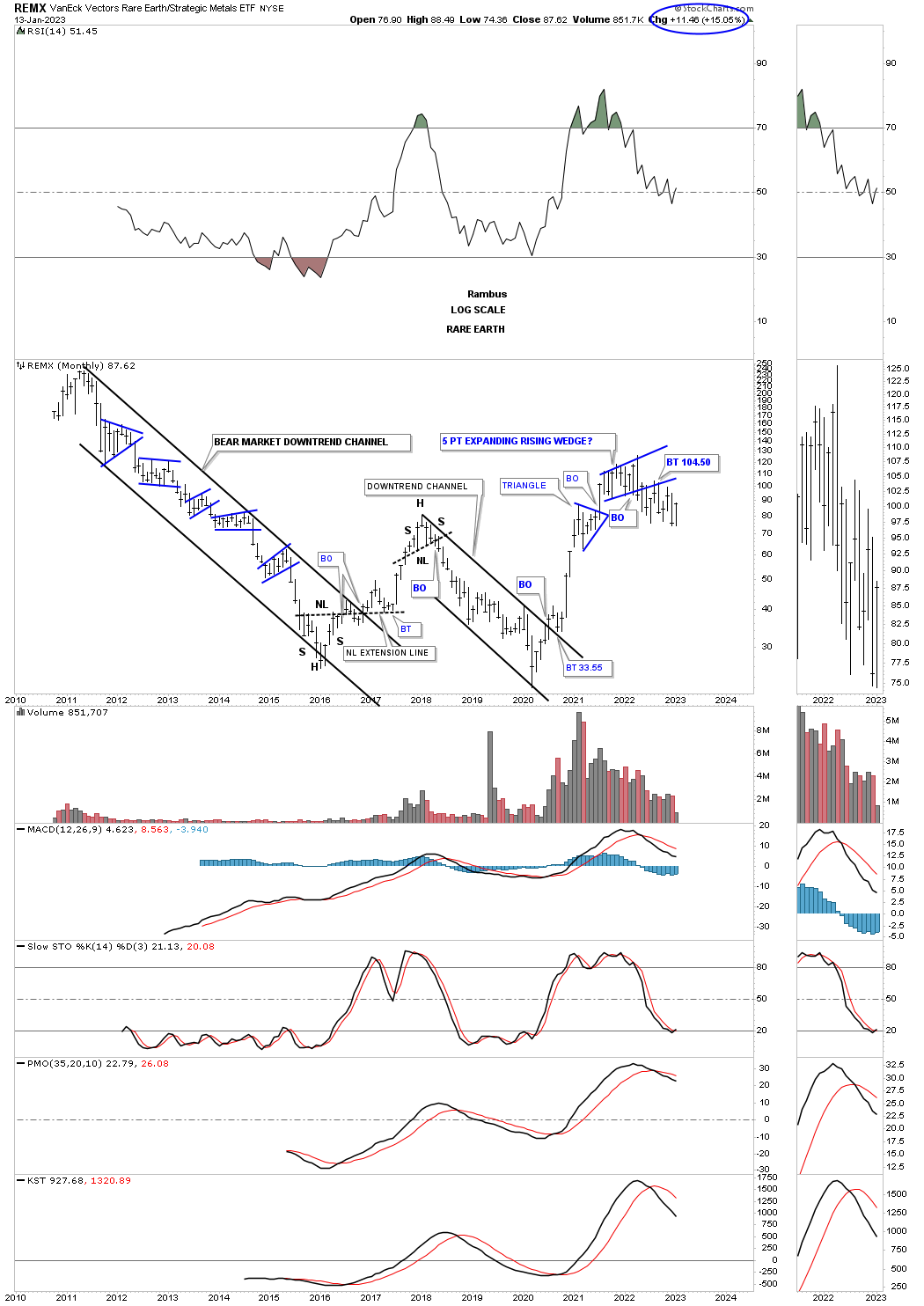
REMX broke down from the blue 5 point expanding rising wedge and has been in backtest mode. There is still a possibility that it could be forming a sideways trading range if the recent lows can hold support.
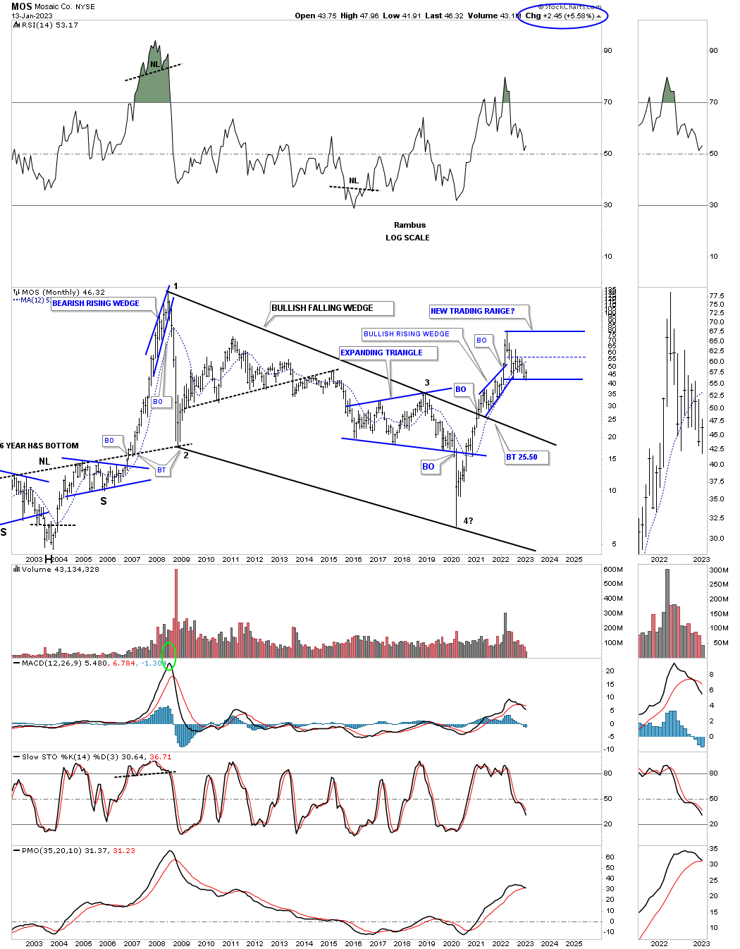
MOS, fertilizer stock, had a massive rally out of its 2020 crash low which ended its bear market. It could be forming a double bottom on the bottom rail of the possible new trading range.
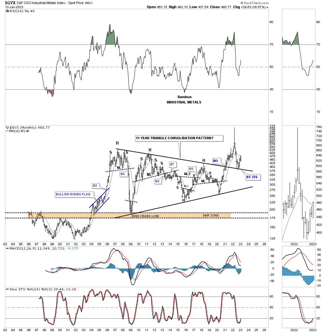
The GYX, industrial metals index, had a massive breakout of its 11 year triangle and has since come back down to backtest the top trendline forming a double bottom as the backtest.
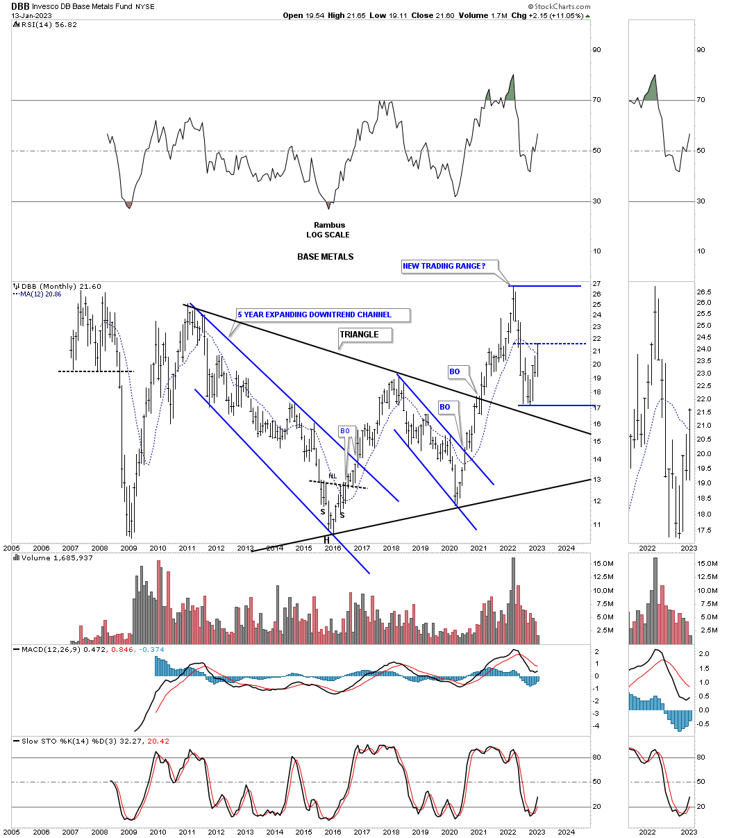
DBB, base metals fund, had a massive breakout and has pulled back to the top trendline forming a possible new trading range.
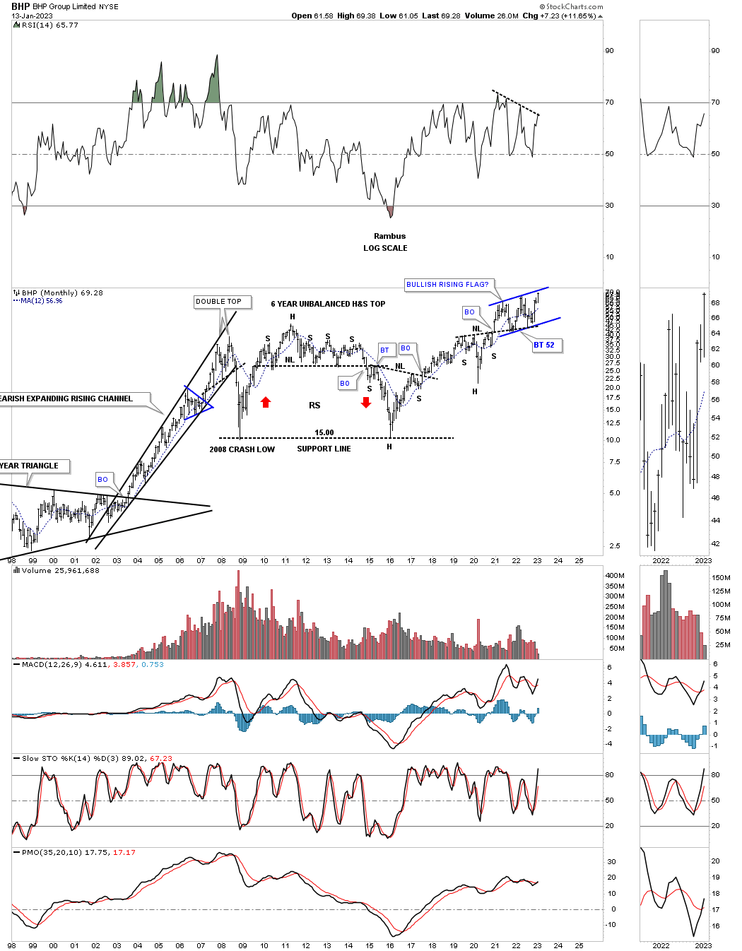
BHP has been building a bullish rising flag closing at a new all time high last week just below the top rail.
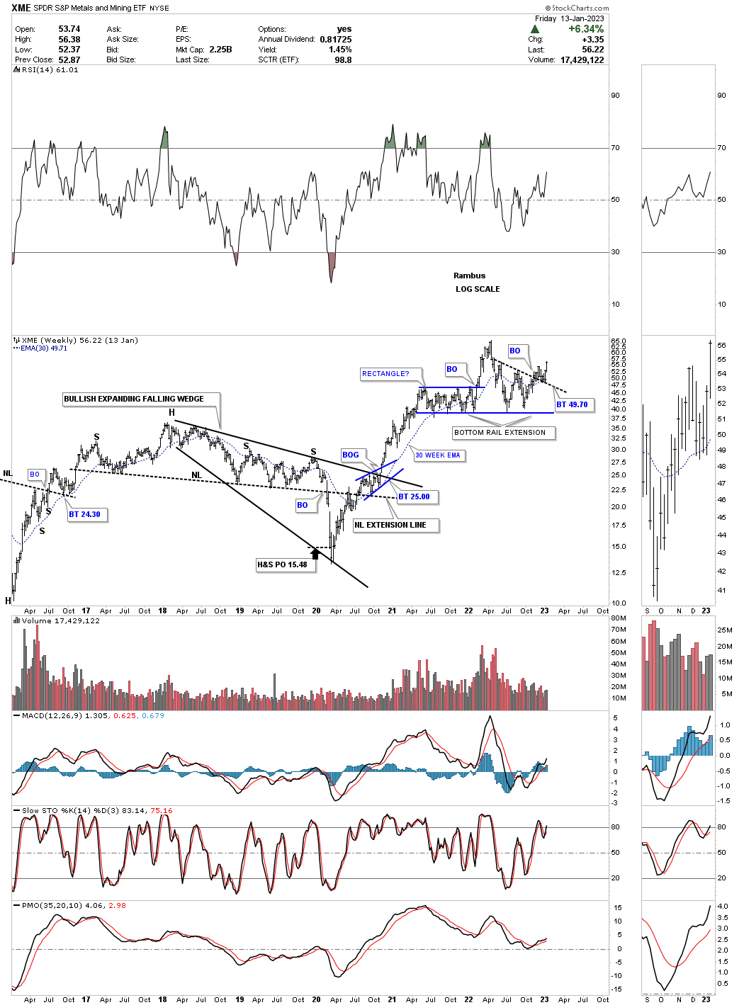
The XME, metals and miners etf, broke out from a double bottom that formed on the bottom rail extension line made from the bottom trendline of the blue rectangle consolidation pattern.
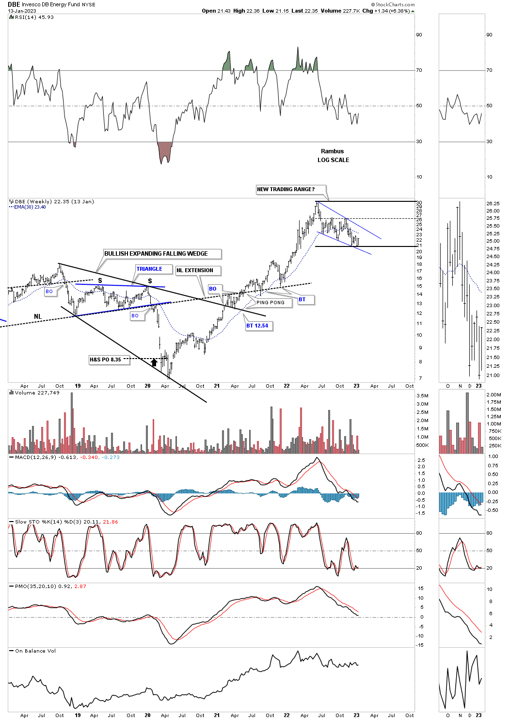
The DBE is the energy fund which has formed the blue falling wedge which could be the beginning of a larger consolidation pattern.
Next is a weekly chart for WTIC which shows the brown shaded support and resistance zone which has been holding support with the formation of a possible expanding falling wedge forming the backtest.
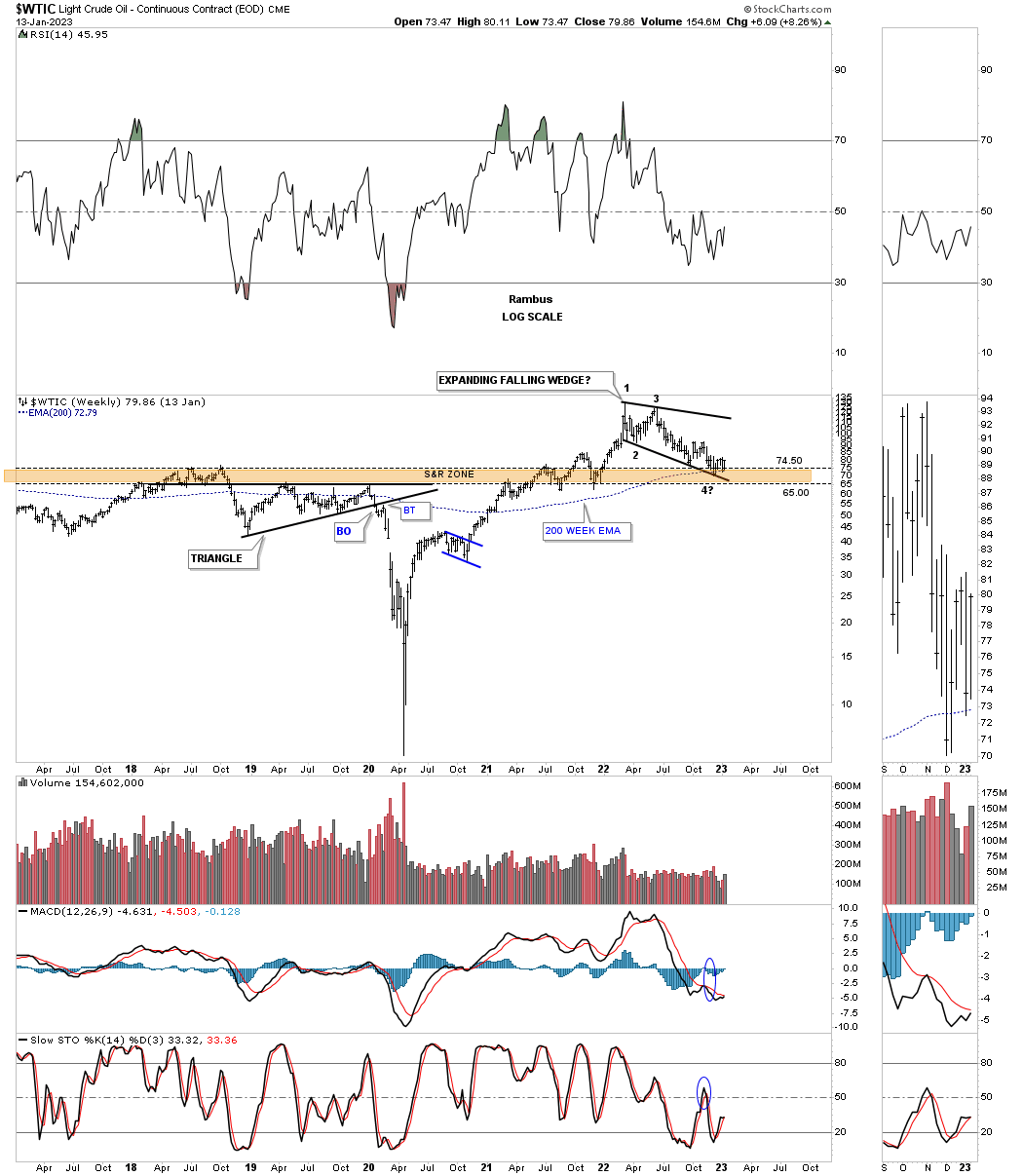
A long term monthly chart showing it could be time for a consolidation phase.
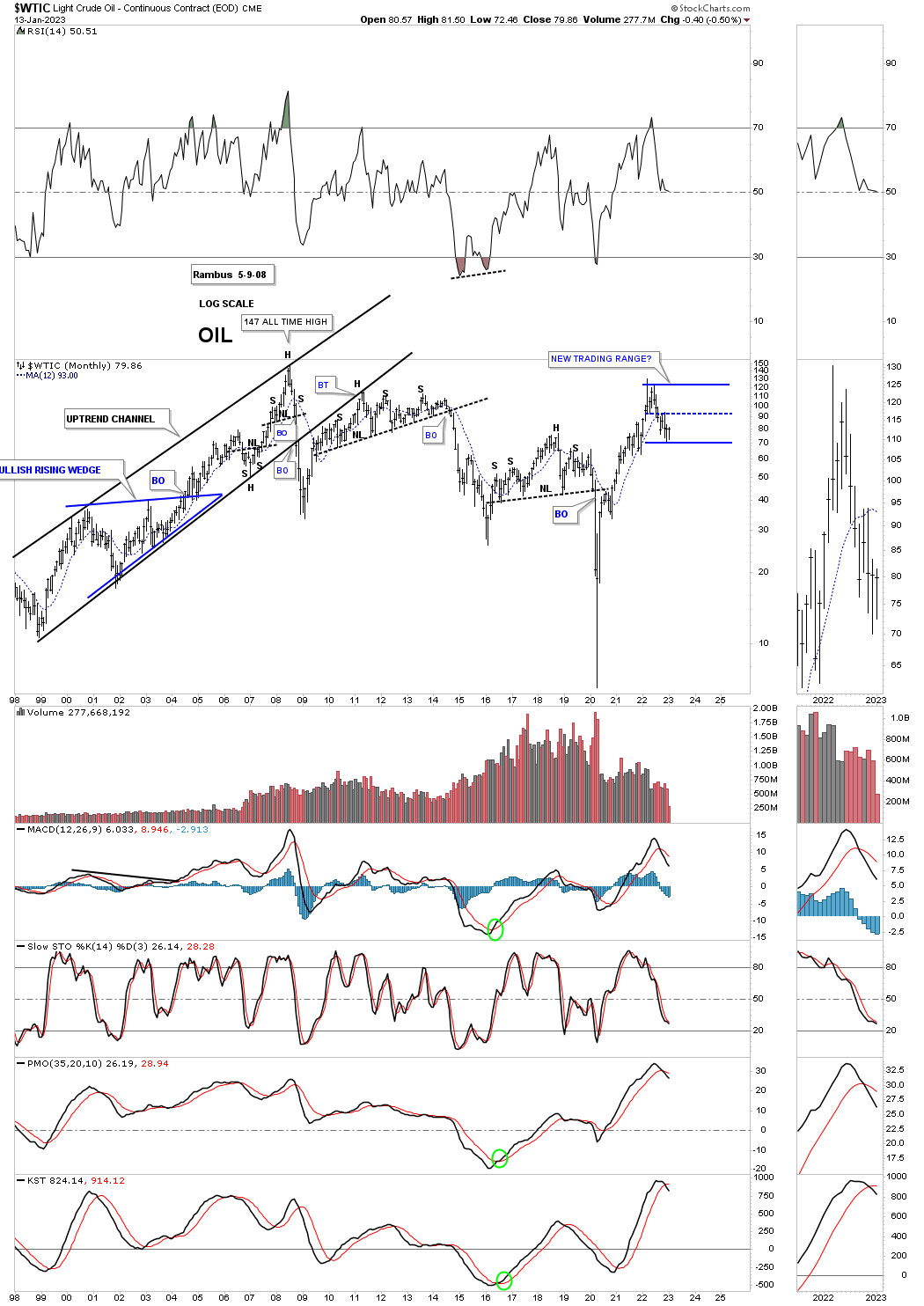
This last chart for tonight is the history chart for WTIC which I originally built back in 2013 during the formation of that massive H&S top looking for an initial move down to the brown shaded S&R zone which we got during the 2014 decline. At that time I also laid out what I thought could happen if the brown shaded S&R zone ever gave way.
After the 2014 low WTIC went on to form another H&S top with the neckline giving way during the 2020 crash. It was always about the reverse symmetry below the brown shaded S&R zone that caught my attention. The current price action is finding support on top of the right shoulder and the 12 month sma which could lead to a bounce back up to the recent high and the formation of a consolidation pattern.
After such a monster move out of the 2020 crash low we shouldn’t be surprised to see most commodities consolidate those gains for awhile. If that plays out it will give us an opportunity to play the swings between the reversal points which can be very profitable if you can figure things out early enough.
When looking at these long term charts above take notice of some of the big bullish expanding falling wedges which the PM complex is currently showing us and why I call these pattern one of the most bullish patterns there is. All the best…Rambus
Related Reading:
- Rambus: Blockbuster Chartology – October, 2022
- Rambus: Blockbuster Chartology – July, 2022
- Rambus: Blockbuster Chartology – May, 2022
- Rambus: Blockbuster Chartology – February, 2022
- Rambus: Blockbuster Chartology – October, 2021
- Rambus: Blockbuster Chartology – July, 2021
- Rambus: Blockbuster Chartology – April, 2021
- Rambus: Blockbuster Chartology – January, 2021
- Rambus: Blockbuster Chartology – October, 2020
- Rambus: Blockbuster Chartology – July, 2020
- Rambus: Blockbuster Chartology – May, 2020
- Rambus: Blockbuster Chartology – January, 2020
- Rambus: Blockbuster Chartology – October, 2019
- Rambus: Blockbuster Chartology – July, 2019
- Rambus: Blockbuster Chartology – April, 2019
- Rambus: Blockbuster Chartology – January, 2019
- Rambus: Blockbuster Chartology – October, 2018
- Rambus: Blockbuster Chartology – July, 2018
- Rambus: Blockbuster Chartology – April, 2018
- 2017 Annual Wrap Up – Does Your Pension Fund Have A Deep State Drain? – January, 2018
- 1st Quarter Wrap Up 2018 Web Presentation
- Blockbuster Chartology with Rambus – October, 2017
- Blockbuster Chartology with Rambus – July, 2017
- Blockbuster Chartology with Rambus – May, 2017
- Blockbuster Chartology with Rambus – January, 2017
- Blockbuster Chartology with Rambus – October 20, 2016
- Blockbuster Chartology with Rambus – July 21, 2016
- Blockbuster Chartology with Rambus – April 21, 2016
- Rambus: Are We in a Deflationary Spiral? – January 28, 2016
- The Dollar, Gold & the S&P 500 with Rambus – October 15, 2015